Shiny Controls 1.3 — Word, Excel and PowerPoint in Your App. Free.
On this page
Go and price a document editing component for .NET. I’ll wait.
You’ll find per-developer licences, per-deployment licences, per-seat runtime royalties, and a surprising number of vendors who want a phone call before they’ll tell you the number. Then you’ll notice that the thing you were quoted renders in a WebView, or only runs on Windows, or handles Word but not Excel, or handles both but has no story at all for Blazor WebAssembly.
Shiny Controls 1.3 ships Word, Excel, PowerPoint and a OneNote-style notebook — editors and viewers, on .NET MAUI and Blazor, drawn natively with SkiaSharp, no WebViews anywhere — in the box, for nothing.
I want to be precise about “for nothing”, because I’ve been burned by that word too: there is no licence, no key, no per-seat anything, no trial watermark, no “free for non-commercial”. It’s the same MIT-licensed NuGet package as the rest of the suite.
Where this lives
 Shiny.Maui.ControlsThe core suite — TimelineView, Ribbon, everything else.Shiny.Blazor.ControlsThe same suite as real Blazor components.Shiny.Maui.Controls.OfficeWord, Excel, PowerPoint and Notebook — editors and viewers.Shiny.Blazor.Controls.OfficeThe same four, on WebAssembly.Shiny.Maui.Controls.CameraCameraView, and now IMediaService.
Before anything else: the whole Blazor gallery is live, and I’d rather you clicked it than read me
describing it. Open a .docx, type in it, drag a shape around, present a deck full screen.
👉 shinyorg.github.io/controls
The bit I keep having to explain: these are not viewers
There’s a reason “Office controls” makes people assume “read-only preview”. Most of them are.
These aren’t. All four are editors, and each one also has a viewer sibling for the read-only case:
| Editor | Viewer | |
|---|---|---|
| Word | DocumentEditorView |
DocumentView |
| PowerPoint | SlideEditorView |
SlideView |
| Excel | SpreadsheetView |
SpreadsheetView + IsReadOnly |
| Notebook | NotebookEditorView |
NotebookEditorView + IsReadOnly |
One SkiaSharp painter, shared verbatim between MAUI and Blazor. One rich-text layout engine. One shape geometry library. One transactional undo stack. That sharing is the whole reason a suite this size is maintainable by a small team — a bug in paragraph layout is one bug, not one per host and one per editor.
New this release: a notebook
The three OOXML editors have been there a while. 1.3 adds a fourth surface that isn’t OOXML at all.
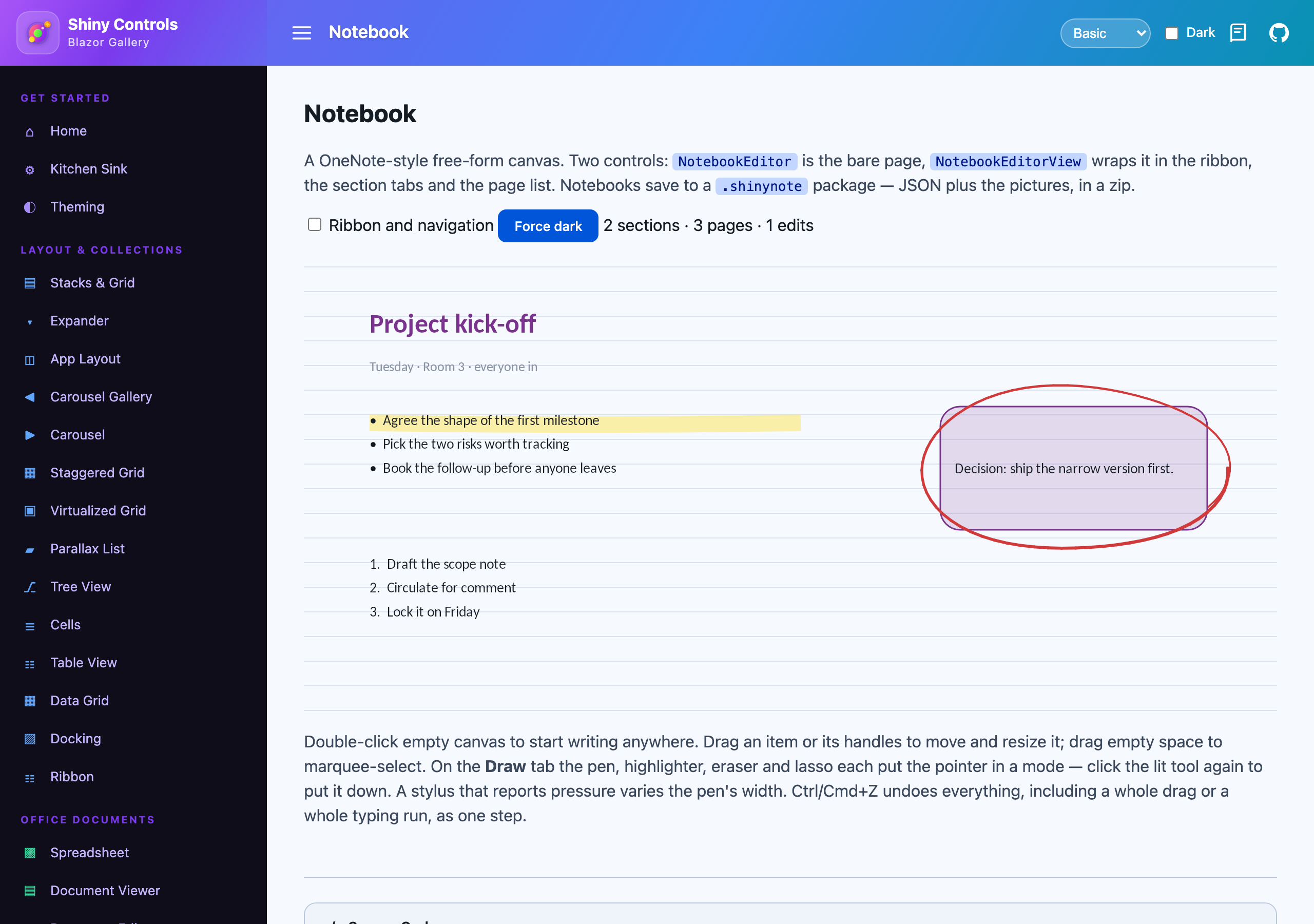
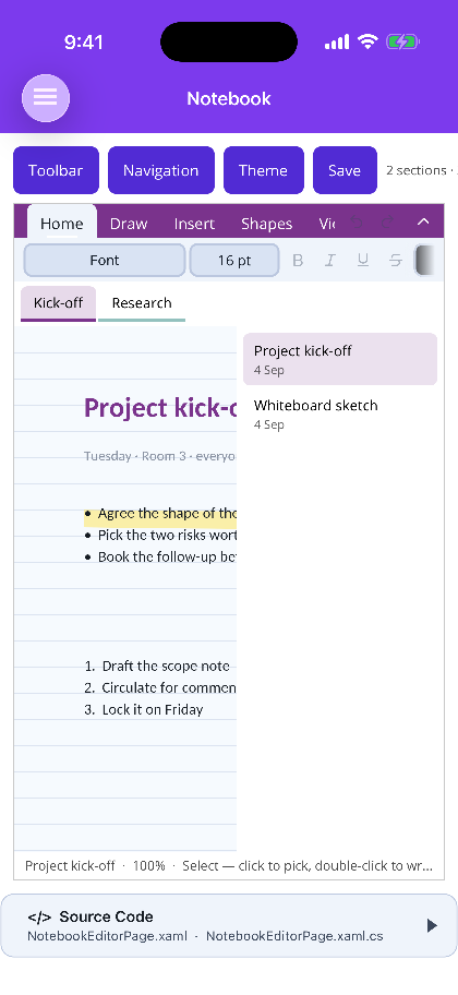
NotebookEditor is a free-form canvas — write anywhere on the page, draw over it with a
pressure-sensitive pen, drop in the same shapes, pictures and rich text as the other editors.
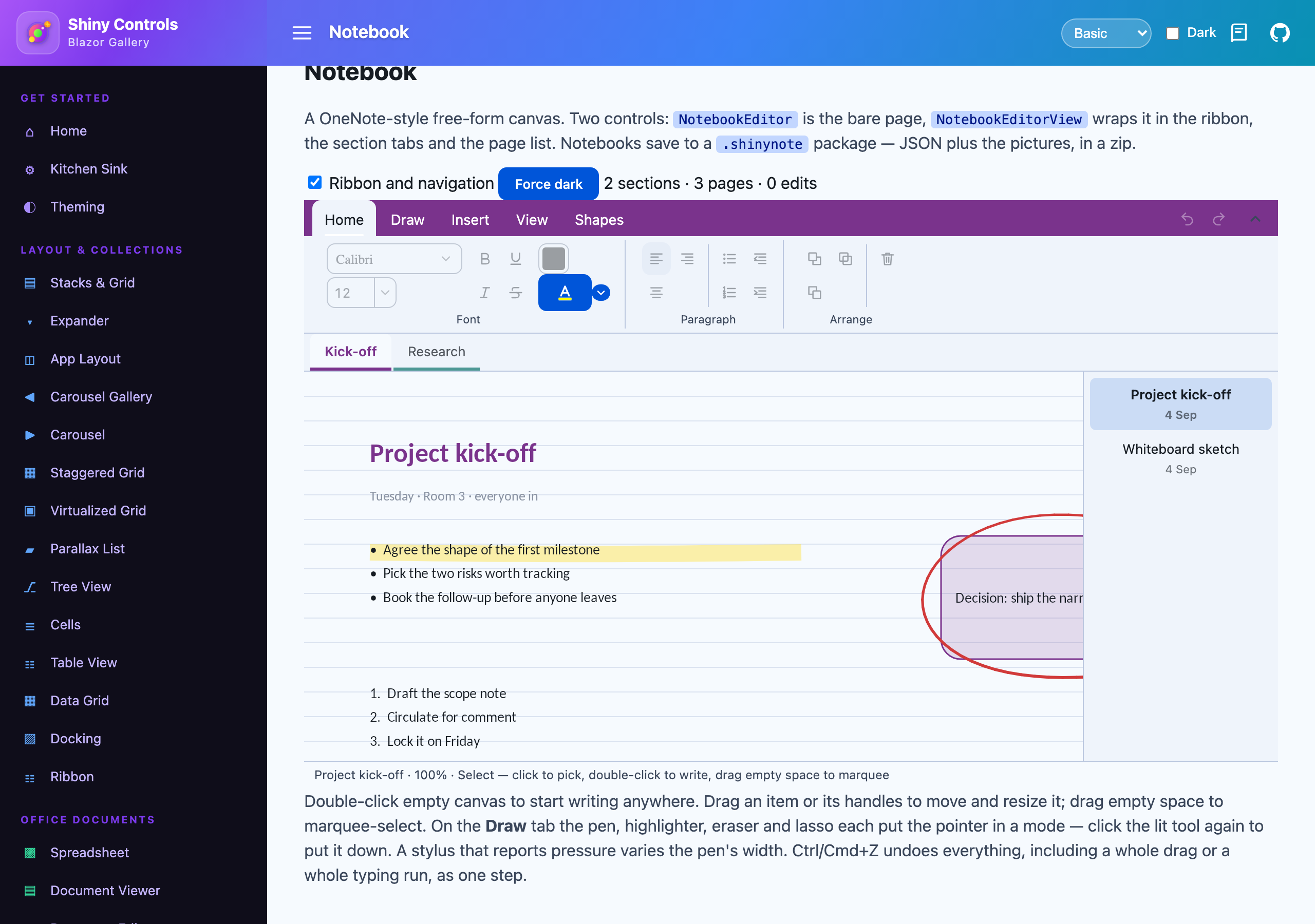
NotebookEditorView wraps it in a ribbon, section tabs and a page list.
var notebook = NotebookDocument.Create("Field notebook");
using var opened = await NotebookDocument.OpenAsync("field.shinynote");<div style="height:640px">
<NotebookEditorView Notebook="notebook" @bind-Tool="tool" />
</div>The interesting design problem here wasn’t ink. It was that a page has no edges.
A slide is a fixed artboard that the viewer fits to the window — you always know how big it is. A document page is a known paper size. A notebook page is neither: it grows to hold whatever you put on it. Its extent is a minimum size unioned with every item’s bounds plus padding, and the canvas scrolls and zooms instead of fitting, so there’s always blank room past the furthest thing to keep writing into. Everything downstream of that — hit testing, scroll extents, the page thumbnail — had to stop assuming a fixed canvas.
The other thing I spent real time on is that ink is a model, not an overlay.
It’s tempting to treat strokes as a bitmap you composite on top. Don’t. Pressure is normalised 0..1 where 0.5 means “no idea” — that’s what a mouse reports, what a finger on a screen with no force sensor reports, and what a stylus mid-flick reports — and it multiplies the pen’s nominal width rather than replacing it. So a stroke drawn with an Apple Pencil and the same stroke drawn with a mouse are the same stroke at different fidelities, and switching device doesn’t change how thick your pen looks.
Two more that fall out of taking the model seriously:
- The highlighter paints beneath every other item on the page. Ink over text is ink over the words, and even at 40% alpha that greys the glyphs — which is precisely what a highlighter is not for.
- The point eraser splits a stroke into two items where it passes through, rather than deleting points out of the middle. A stroke is a single path, so a gap in the point list gets painted as a straight line across the thing you just rubbed out.
And hit-testing works against the stroke’s path, not its bounding box. A stroke’s rectangle is mostly empty air; treat it as solid and one flourish swallows every click in that corner of the page, and lassoing one word of a handwritten line takes the whole line.
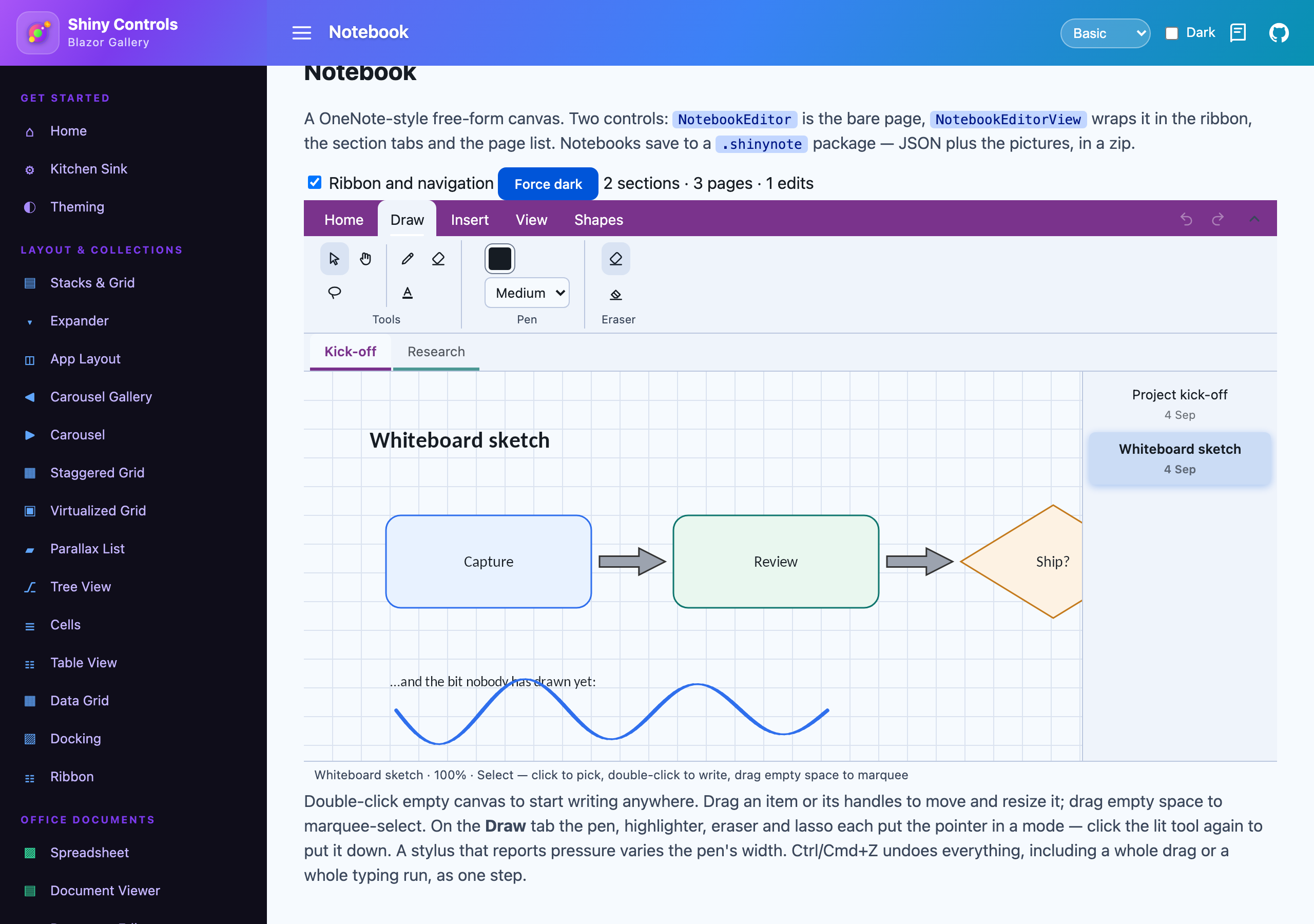
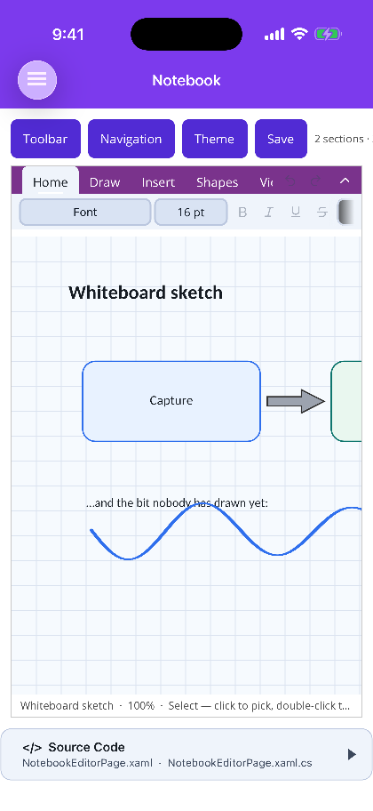
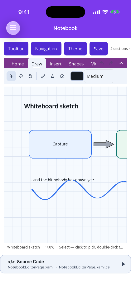
Here it is on Blazor — the whole thing with its ribbon, section tabs and page list, then the Draw tab
over a sketch page, then NotebookEditor on its own with no chrome at all:
And the same control on MAUI, on a phone, where the page list is a panel rather than a column:
Files are .shinynote — a zip holding notebook.json, one JSON file per page under pages/, and the
pictures as files under media/. Pages are separate entries because a notebook is the one Office-shaped
thing here that genuinely grows without bound, and a manifest you have to parse in full to open the page
someone just clicked is the wrong shape for that. It also means one corrupt page doesn’t take the
notebook with it.
Everything got a ribbon
Here’s the thing I got wrong the first time. All four editors had a toolbar, and every one of them was a single horizontally-scrolling strip of two dozen icons separated by anonymous hairlines. It looked tidy in a screenshot and it was miserable to actually use, because there is no way to learn a bar like that. Nothing is named. Nothing is grouped. You hunt.
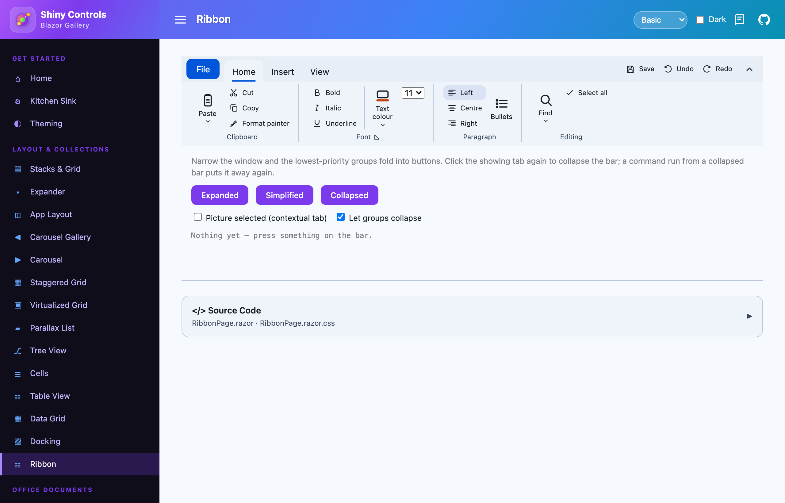
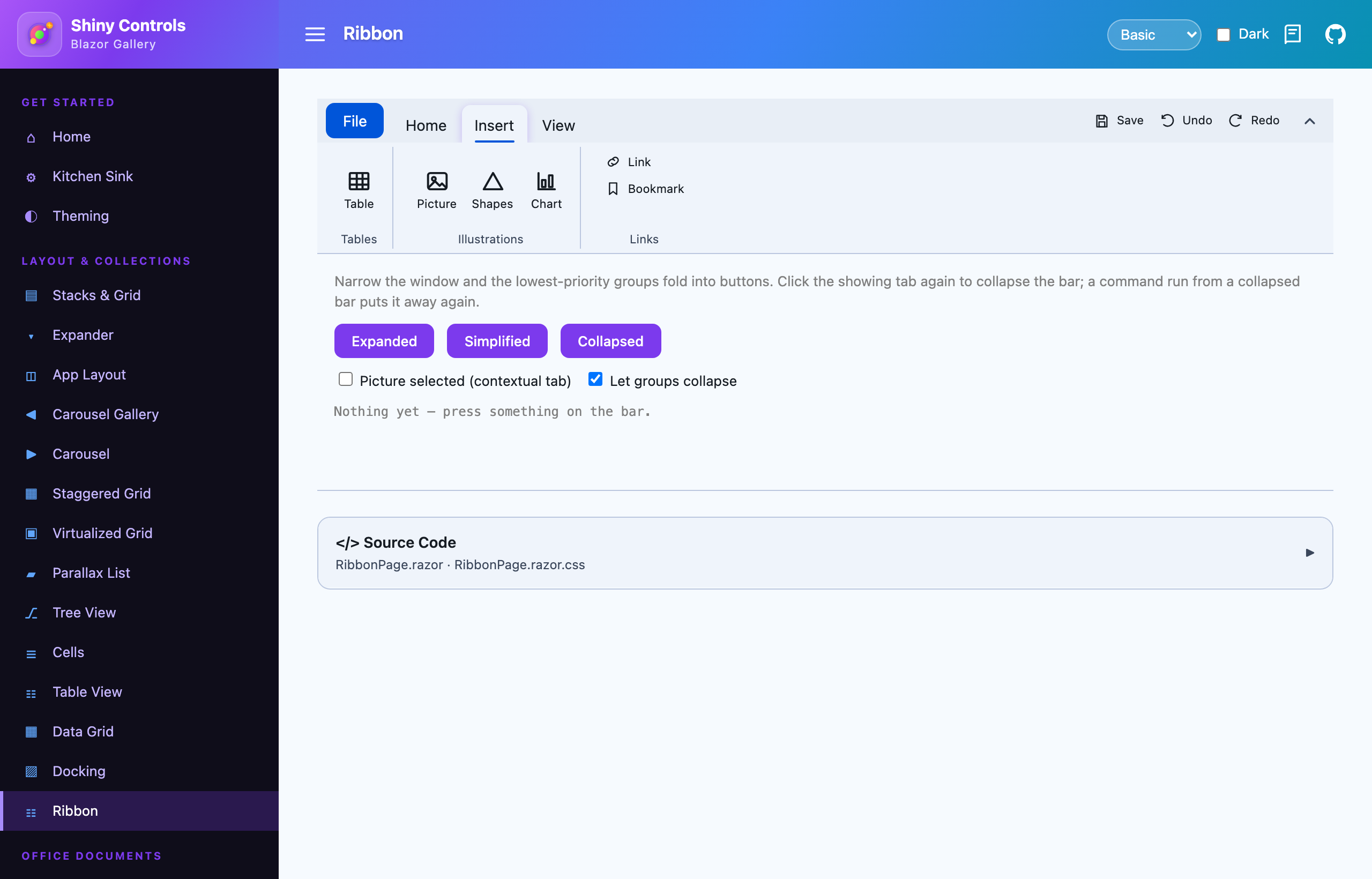
They’re real ribbons now — titled groups, on tabs, with undo and redo in a quick access row where they never move:
| Control | Tabs |
|---|---|
| Spreadsheet | Home (Clipboard · Font · Alignment · Number · Editing) · Data (Cells · Columns · Functions) |
| Document Editor | Home (Font · Paragraph · Proofing) · Layout (Page Setup · Insert · Zoom) · Shapes |
| Slide Editor | Home (Slide · Font · Paragraph) · Insert · Shapes |
| Image Editor | Home (Tools · Shapes · Image) · View · contextual Drawing / Shape / Text Tools |
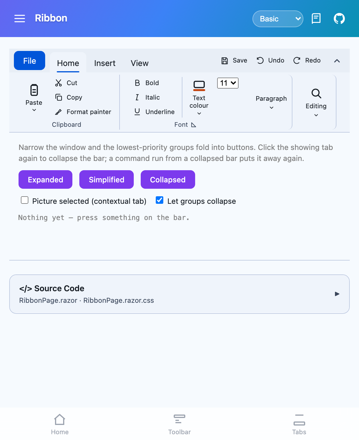
Here’s the bar itself on Blazor — the Home tab in named groups, the Insert tab, and the same bar in a window too narrow for all of it, with the lowest-priority groups folded into buttons:
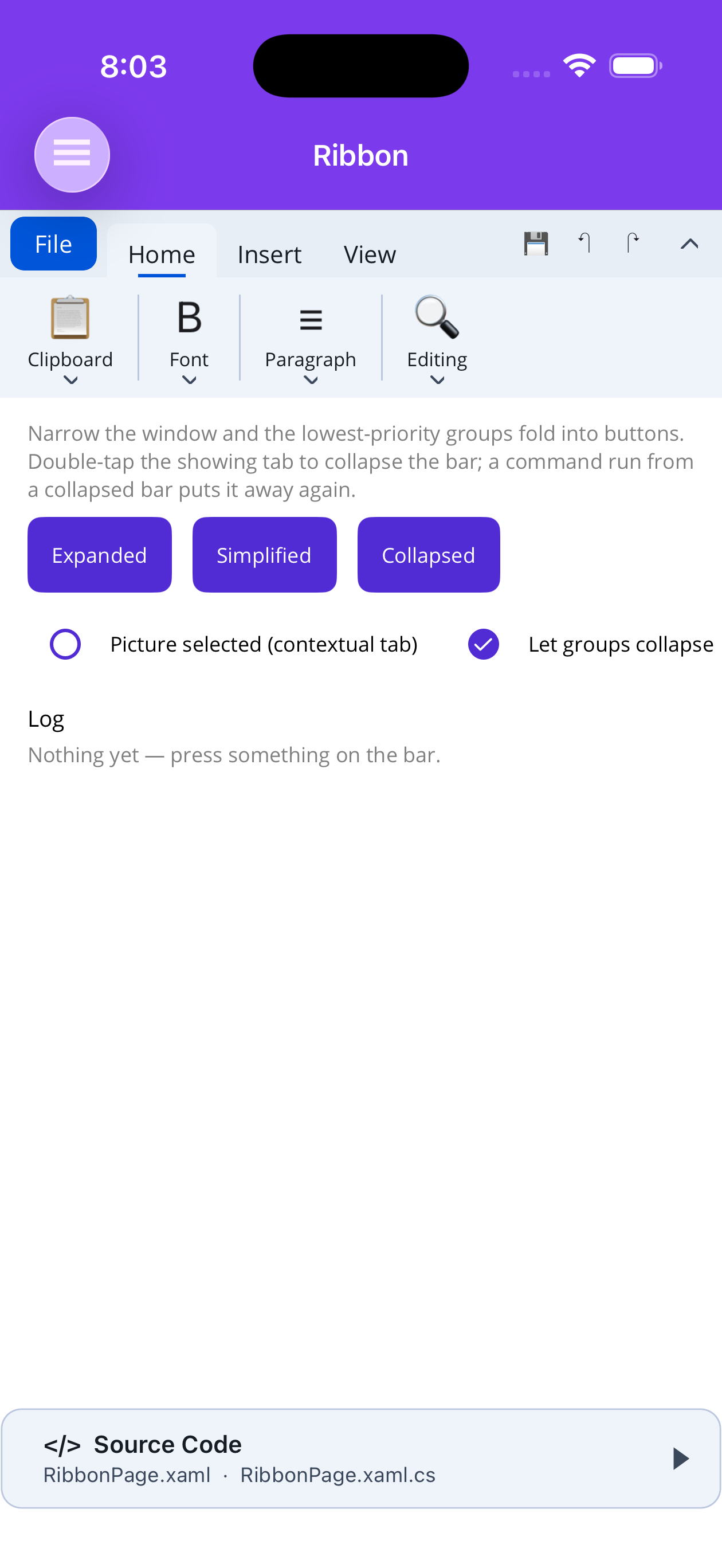
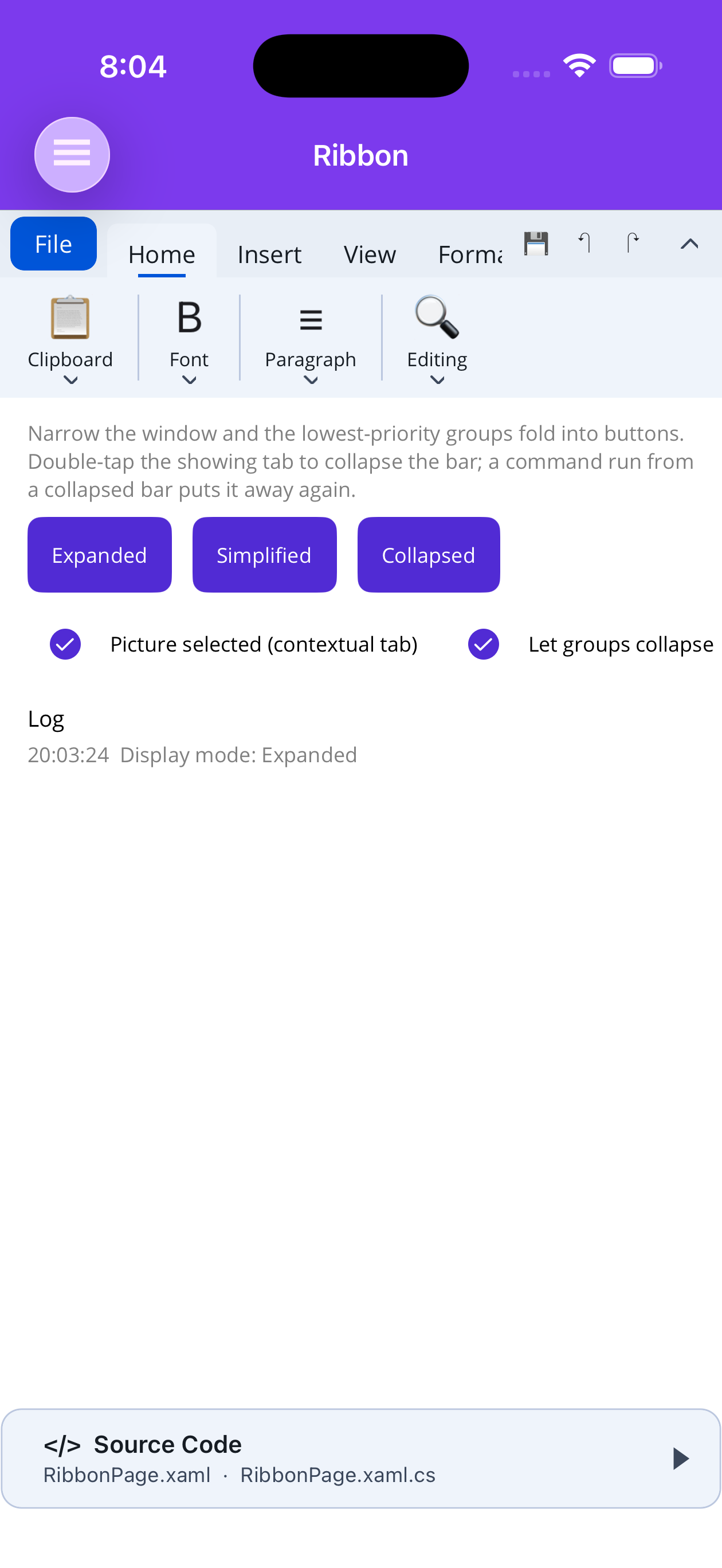
And on MAUI at phone width, where every group is a single button, plus a contextual tab that only exists while a picture is selected:
The split is by what a command changes, not by how often you reach it. On the spreadsheet, Home
changes how a cell looks and Data changes the shape of the sheet under it. That split is what let the
structural half finally grow: delete rows and columns, a Width split button that fits columns to
their contents (and offers the sheet’s own default, which is the only way back once you’ve dragged a
column), hide and unhide, and a function library giving SUM, AVERAGE, COUNT, MIN and MAX a button each.
All of that already existed on SpreadsheetController. There was just nowhere to put it.
I tried the document editor with four tabs first. Insert, Layout and Review each ended up holding a single group — a click to reach a bar with one button on it — so it’s two, and Proofing rides on Home, because spelling is something you do while writing rather than as a separate pass. The slide editor stops at two for a different reason: a slide is always scaled to fit the viewport, so there’s nothing to pan to and nothing to zoom in on, and no third tab worth the click.
Shapes became a tab rather than a dropdown, in both editors. Twenty shapes behind one button is a panel big enough to cover the document it’s about to draw on, and you have to dismiss it before you can see what you did. Each button is drawn using the same polygon, star and arrow maths the painter uses to lay that shape into the document — hand-drawn icons drift from what actually gets inserted the first time either side is touched.
Two things came out of this that belong to Ribbon itself rather than to any editor:
Ribbon.SimplifyBelowWidth flips the bar to its dense one-row layout automatically. Group
collapsing — folding groups into dropdowns, worst-first — is the right answer when a window is a little
too narrow and completely the wrong one on a phone, where there’s room for no group at all and every
single command ends up behind a dropdown. That’s worse than the strip it replaced. Three controls
wanted the same rule, so the rule belongs to the ribbon.
A ribbon that scrolls now says so. Where collapsing is off, or the collapsed groups still don’t fit, the body scrolls — and a scrolling bar looked exactly like one that didn’t, because the last group ended flush at the edge with nothing to suggest another followed. Both hosts fade whichever edge still has content past it. The platform scroll indicator isn’t the fix: on iOS and Android it only appears once a scroll is already under way, which is after the moment the user needed to be told.
Breaking, MAUI only. The
Ribbonmoved out ofShiny.Maui.Controls.Desktopand intoShiny.Maui.Controls, namespace and all —Shiny.Maui.Controls.Desktop.RibbonsbecomesShiny.Maui.Controls.Ribbons. The desktop package’s target frameworks stop at the desktop ones, which put the ribbon out of reach of every core control that wanted it, and core can’t reference an add-on that references core. Your XAML is unaffected — it was always mapped onto thehttp://shiny.net/maui/controlsURI, soshiny:Ribbonreads exactly as before and only a C#usingneeds touching. Blazor already had it in core.
Find, on all three
Ctrl+F is one of those features that seems like an afternoon until you write it. It’s on the Word,
PowerPoint and Excel toolbars now — a box, a 3/12 readout, previous/next — as one OfficeFindBar per
host over one IFindController that all three finders implement. The bar genuinely has no idea whether
“the next one” is a paragraph below the fold, a shape on slide nine, or a cell three sheets over.
The decisions that took the time:
- It steps onto the first hit at or after the caret, not the top of the document. A find that always restarts at the beginning takes you away from what you were reading.
- The arrows wrap, because a “next” that goes quiet at the last hit is indistinguishable from one that has finished the document.
- A hit is selected, not merely scrolled to. Everything you do after finding a word operates on the word.
- Every hit is washed amber and the current one is drawn as the selection instead of stacking both. Stacking was my first attempt and it made the active match a muddy blend — the hardest thing on the page to pick out, which is the exact opposite of the point.
What each search covers is decided by what its arrows can reach, which is a rule I’d apply anywhere:
Word searches paragraphs and not table cells, because a document position is a block plus an offset and
a table has neither — counting those hits promises a “next” that can never step to them. PowerPoint
searches the whole deck but only shapes a slide itself owns, or the company name in the master counts
once per slide and steps you into something you can’t select. Excel searches cell text as the formula
bar shows it, which is the only choice under which searching SUM finds the cells that total
something.
Decks present now
SlideView had one job: show a deck to the person holding the device. It has a second one now — show
it to a room.
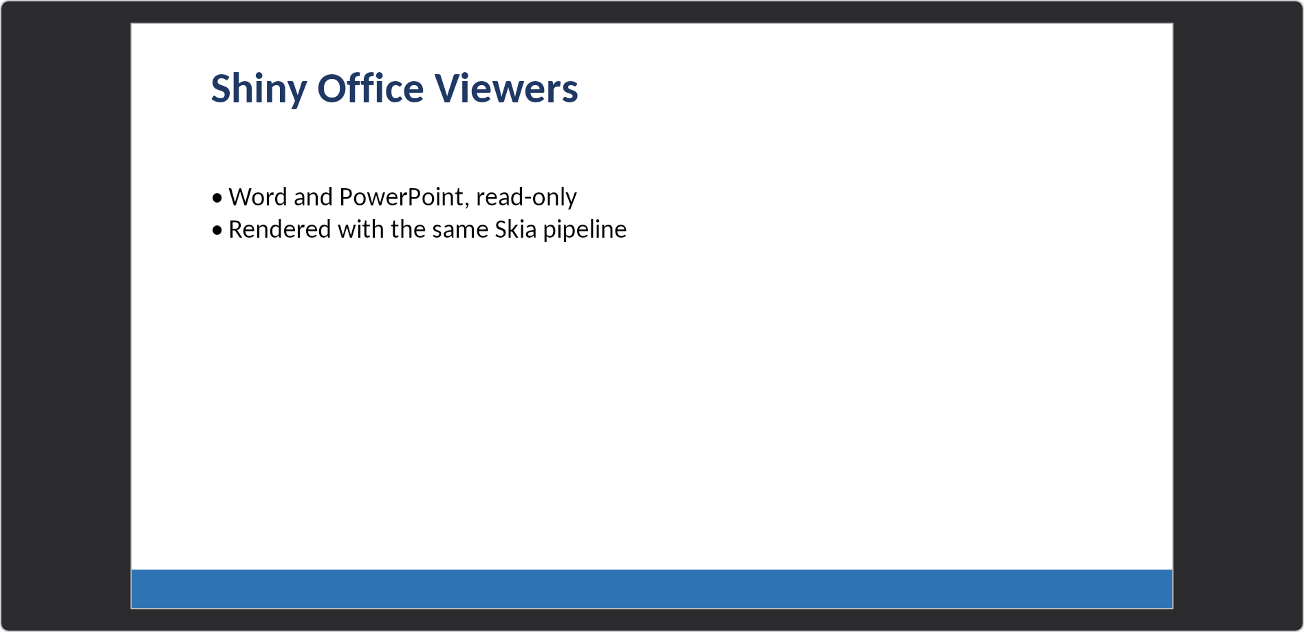
That’s the inline viewer. Presenting takes the border off, blacks the surround out, and fits the slide edge to edge with the auto-hiding bar over it.
this.Viewer.StartPresenting(); // MAUI<SlideView @ref="viewer" Deck="deck" @bind-IsPresenting="presenting" />
@code {
Task PresentAsync() => this.viewer!.StartPresentingAsync(); // Blazor
}Slide edge to edge on black, no border, no margin, app chrome gone, and an auto-hiding control bar — previous, counter, next, Notes, Exit — that fades and comes back on a touch or a pointer move. Tapping advances; the left quarter goes back. Speaker notes are in there, and the notes panel deliberately doesn’t fade with the bar: you read notes while you’re talking, not while you’re moving the mouse, so putting them on the chrome’s timer means wiggling the pointer to finish a sentence.
Presenting also pins the theme — black surround whatever the app is set to, slide border dropped. A viewer’s chrome is part of an app, but on a projector any lift at all reads as a grey frame around your deck.
Two host-specific notes, both of which cost me an afternoon each:
On MAUI the show is a modal page carrying its own SlideView, not the caller’s viewer re-parented.
Moving a view in the tree rebuilds its platform view, which on a canvas is a visible stall — and it also
gets its own controller, because a controller owns a viewport, and sharing one leaves the inline viewer
laid out for a projector after the show ends with nothing to size it back. Only the index crosses back.
A modal page is also what makes the platform back gesture work.
On Blazor the CSS covers the viewport first and the Fullscreen API is asked for on top. An iframe
without allowfullscreen, iOS Safari, prerendering, a gesture the browser didn’t like — requestFullscreen
gets refused for all sorts of reasons, and a refusal still has to give the room a full-window deck rather
than nothing at all. F5 starts, Escape leaves, which are PowerPoint’s keys. Call
StartPresentingAsync() rather than setting the bound parameter: a browser only grants fullscreen inside
the gesture that asked for it, and a round trip through a parameter loses that gesture.
The unglamorous Office list
Individually small, collectively the difference between a demo and something you’d hand a user:
- Page orientation — two toggles rather than one, because a page is one of two things rather than
on or off. Turning the paper swaps the dimensions and writes
w:orient; do one without the other and Word either shows the wrong state or silently re-swaps on open. - Page numbers, headers, footers, page breaks, print layout — all four were in the controller and reachable only from code. The page number appends to a header that’s already there rather than replacing it, because adding a number should not silently delete your title.
- Margins are four buttons, not one button opening a sheet of four. Four is few enough to show, and the entire point of a ribbon is that the choices are on it.
- Zoom, and fit-width. Pinch on touch, ctrl-wheel on desktop, 50–300% on the Layout tab. Fit-width sets the zoom so the page exactly spans the window, which on a phone is the difference between a document you can read and one you pan across a line at a time.
- Cut, copy, paste, insert row/column on the spreadsheet — whole rows and columns, with values, formulas and formatting, as one undoable step. A marching-ants border marks what’s on the clipboard, in its own colour rather than a dashed version of the selection green, since marking a source and then moving to a destination is the entire shape of a paste and both are on screen at once.
- Touch panning on both editable surfaces. A drag meant “extend the selection”, which is right for a mouse and leaves touch with no way to scroll — on a phone you literally could not reach a column off the right edge. Under touch, tap selects, drag pans, and you extend the selection with round handles on its ends. Nothing changes for a mouse, and the pointer kind is read per-event rather than decided per-platform, because both turn up in one session on an iPad with a trackpad.
- Spelling suggestions above the keyboard on iOS and Android. The red squiggle was the whole of what
a phone user got, since the correction menu hangs off a long press — and nobody long-presses a word
they weren’t already suspicious of. There’s a real
InputAccessoryViewon iOS and an IME-anchored bar on Android, with Ignore and Add. From the toolbar, Home ▸ Proofing walks the errors in either direction for a full review loop. - Watermarks on the viewers as well as the editors — a DRAFT stamp, a logo — defaulting to a 0.15 wash, because the failure people actually hit is one drawn at full strength that makes the page unusable. It’s a display watermark, drawn rather than written into the file, and that’s deliberate: Word keeps a VML shape in the header part, Excel has no watermark at all and fakes one with a header image, PowerPoint expects a picture on the slide master. Persisting means three unrelated mechanisms; drawing means one.
- Each control wears its own colour.
Accentpaints the ribbon header, tab ink and underline, and defaults to what Microsoft’s own apps wear — Excel green#107C41, Word blue#185ABD, PowerPoint red#C43E1C. That’s a default rather than a sample setting on purpose: people read those colours as “spreadsheet” and “slides” before they’ve read a single label. It’s the one part of an Office control deliberately not taken from your app theme. Set your own brand colour, ornullto fall back to the theme.
IMediaService — a camera you call, not a screen you build
Different corner of the release, same complaint underneath.
Most apps reaching for a camera do not want a camera screen. They want a result: a photo of a
receipt, a barcode, the digits off a credit card. MAUI’s IMediaPicker gets you there by handing the
job to the system camera UI — which can’t show a scan reticle, a bounding box, an effect strip, or a
single word of your own copy. So every app that needs any of that hand-rolls a camera page. I have
written that page more times than I want to count.
That page is now the service:
builder
    .UseShinyControls()
    .UseShinyCamera(media =>
    {
        media.CompressionQuality = 85;
        media.MaxDimension = 2048;
        media.OutputFormat = MediaImageFormat.Jpeg;
    });
public class DeliveryViewModel(IMediaService media)
{
public async Task CapturePod()
{
var photo = await media.TakePhotoAsync(new PhotoCaptureOptions
{
Title = "Proof of delivery",
Instructions = "Fit the whole label in frame"
});
if (photo is not null)
await photo.SaveAsync(Path.Combine(FileSystem.AppDataDirectory, "pod.jpg"));
}
}Permissions, capture, recording, gallery picking — and, from the analyzer add-ons, one verb per document type:
var code     = await media.ScanBarcodeAsync();          // closes on the first hit
var card     = await media.ScanCreditCardAsync();
var licence  = await media.ScanDriversLicenseAsync();
var passport = await media.ScanPassportAsync();
var contact  = await media.ScanBusinessCardAsync();

await foreach (var scanned in media.ScanBarcodesAsync()) // stays up and streams
    this.Codes.Add(scanned.Value);
Every scan comes in two shapes, and the plural one is the real one. The modal opens when enumeration
starts and closes when it ends, so the singular overload is literally “take the first, then stop
enumerating” — which means cancellation, the user tapping ✓, MaxResults and Timeout all end it
through exactly one path instead of four.
Some decisions you’d otherwise discover the hard way:
- Cancel returns
null, it doesn’t throw. A cancelled camera is an ordinary outcome, and everything that presents UI asks for its own permissions first. - The modal has no localizable strings. Close, torch, flip, flash, retake and accept are drawn vector
paths — not font glyphs, not emoji, both of which render at a different size and weight on every
platform. The practical half matters more than the aesthetic one: there’s nothing on that page for you
to translate. The only text it shows is the
TitleandInstructionsyou hand it, already localized. - A scan modal has no capture button at all. Not a hidden one. The camera is on and streaming results; a shutter invites a tap with nothing for a still to be the result of.
- Compression defaults live at registration. “Our photos are 85% JPEG capped at 2048px” gets said once instead of at twenty call sites. The per-call options are nullable specifically so unset is distinguishable from deliberately 92 — without that, the app-wide default silently never applies. And nothing is re-encoded when nothing was asked for.
- Duplicate filtering is on by default, with a key chosen per type rather than by generic equality. Symbology plus value for a barcode, because the same digits as an EAN-13 and as a QR code are two different scans. Merchant, date and total for a receipt, which carries no reliable identifier at all.
- The service knows nothing about barcodes. There’s one primitive —
ScanAsync<T>— and each analyzer package hangs its typed verb off it. It’s public, so an analyzer I ship no verb for is a dozen lines of your code rather than a fork of mine.
TimelineView
Small control, kept getting asked for. A vertical rail of markers with arbitrary content beside each one — an activity feed, an order’s progress, an audit trail, a changelog.
<shiny:TimelineView ItemsSource="{Binding Events}" ActiveIndex="2">
    <shiny:TimelineView.ItemTemplate>
        <DataTemplate>
            <VerticalStackLayout Spacing="2">
                <Label Text="{Binding Title}" FontAttributes="Bold" />
                <Label Text="{Binding Detail}" FontSize="13" Opacity="0.75" />
            </VerticalStackLayout>
        </DataTemplate>
    </shiny:TimelineView.ItemTemplate>
</shiny:TimelineView>
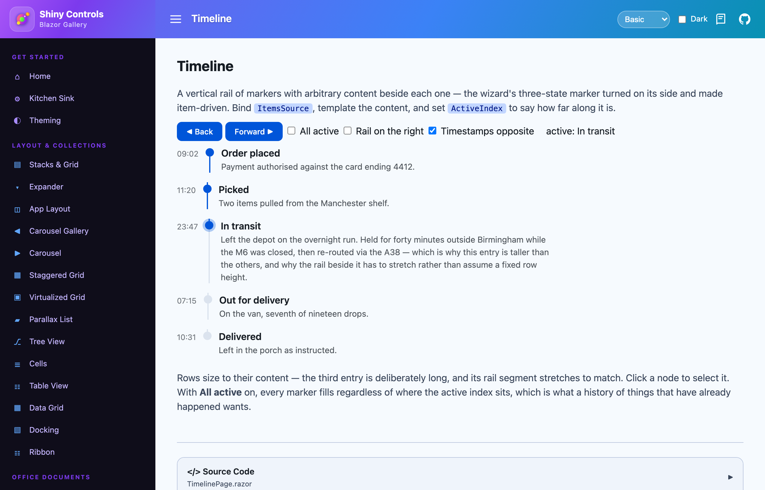
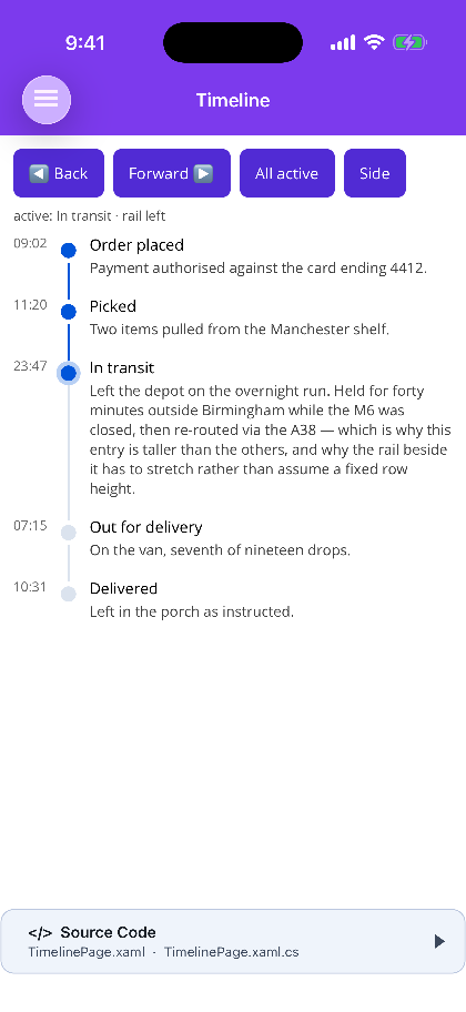
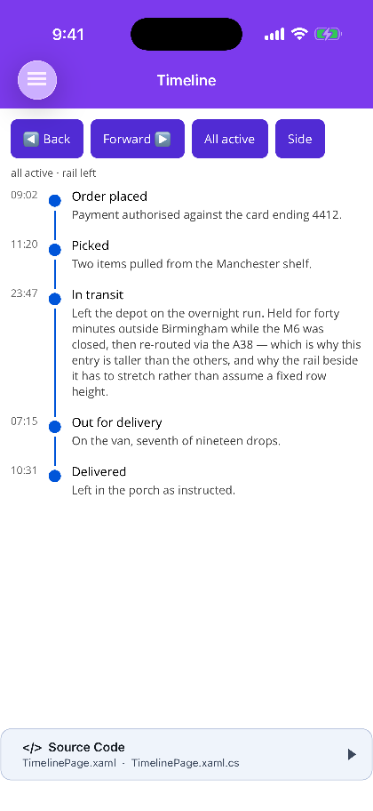
ActiveIndex says how far along it is — before it complete, at it current and ringed, after it pending,
with the connector filling to match so the rail reads as a progress bar rather than a set of unrelated
links. It defaults to -1, because a timeline handed no position shouldn’t silently claim its first
entry has happened.
Rows size to their content, and that’s what decides how the rail is built. The connector is drawn per row rather than as one continuous line behind the stack — a single line would need measuring against a total height nothing knows until after layout, and content beside a timeline is arbitrary and self-sizing by definition. The marker sits slightly below the top of its row so it aligns with the first line of text rather than the middle of the content box, which otherwise drifts further out the taller the content gets.
It is not virtualized on either host, and that’s the deliberate trade: rows of wildly differing height are exactly what a recycling list is worst at.
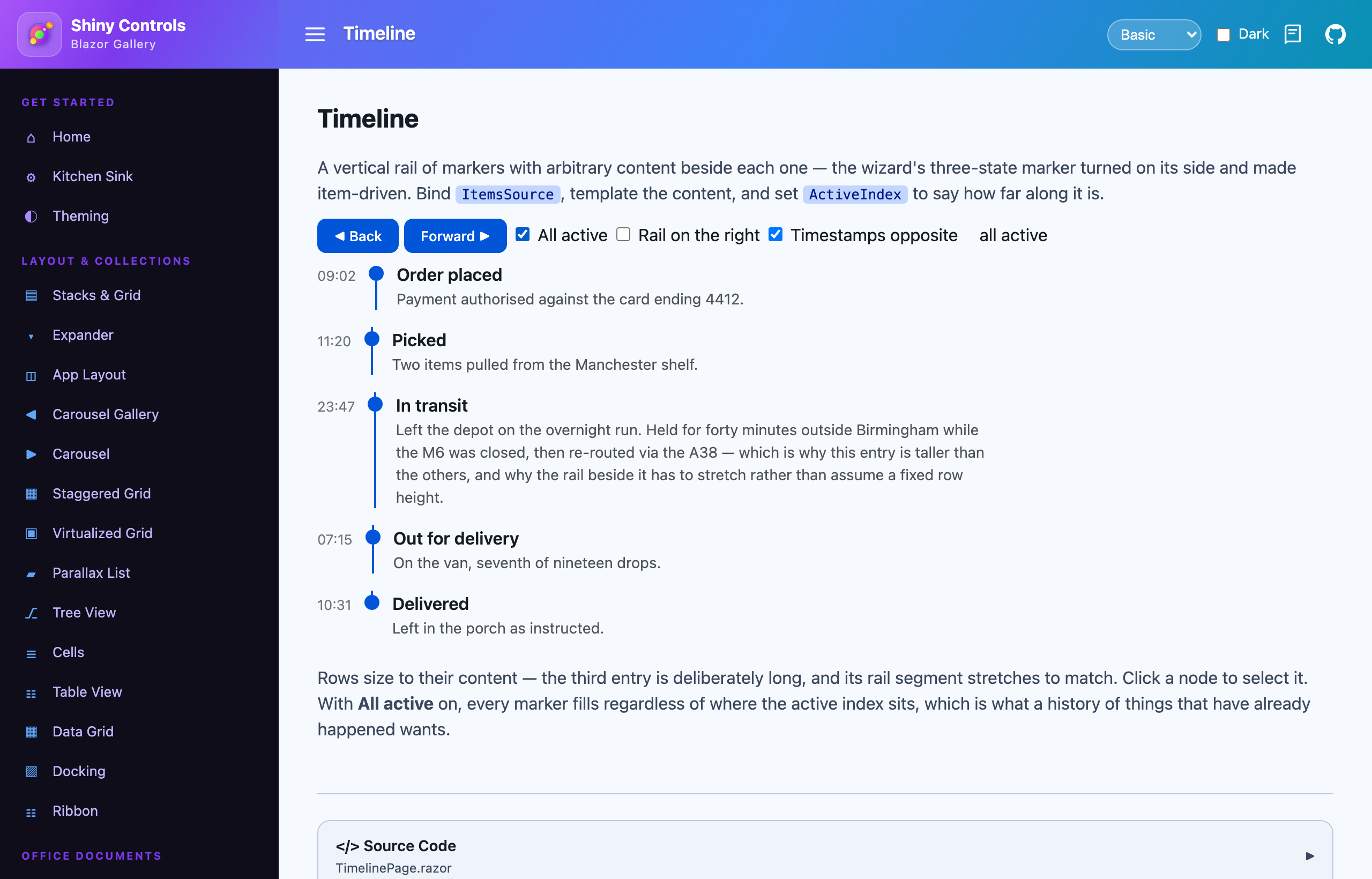
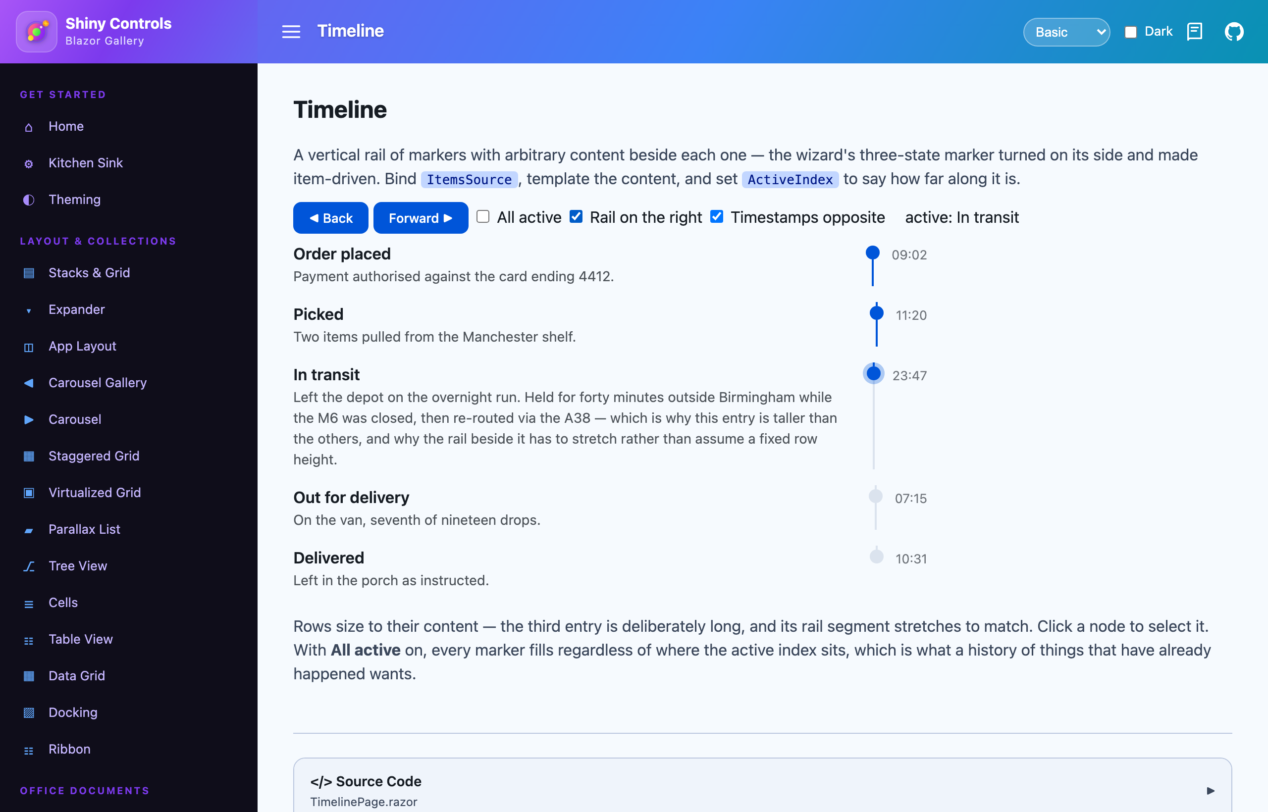
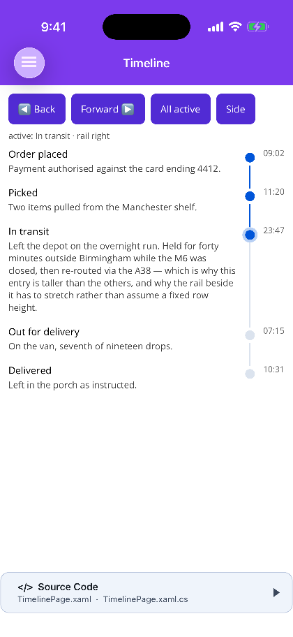
Blazor first, then MAUI — the default, AllActive, and the rail moved to the right:
Motion icons: 42 → 111
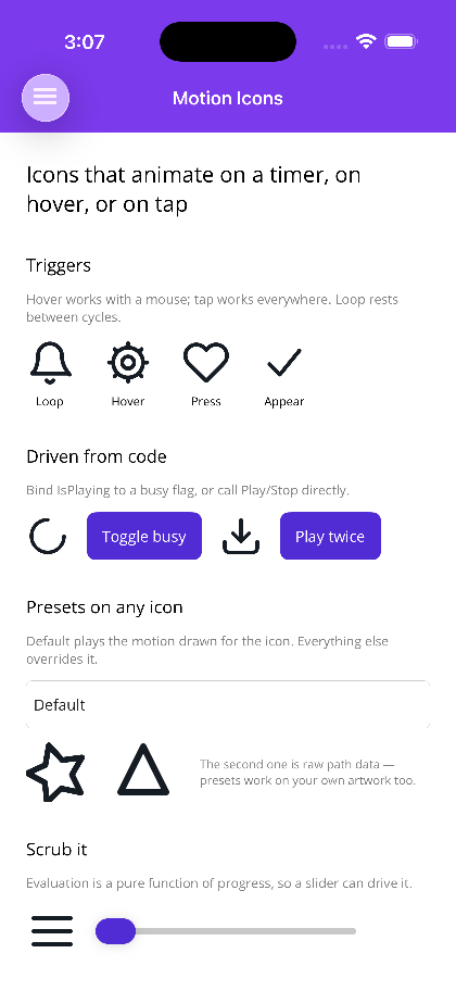
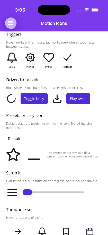
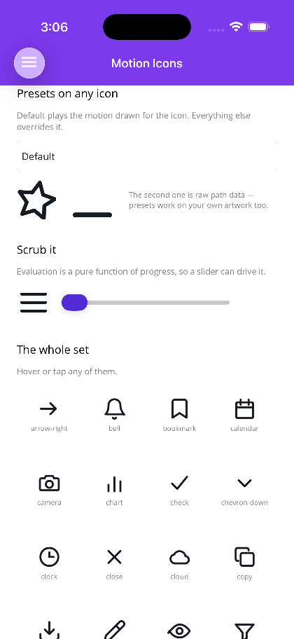
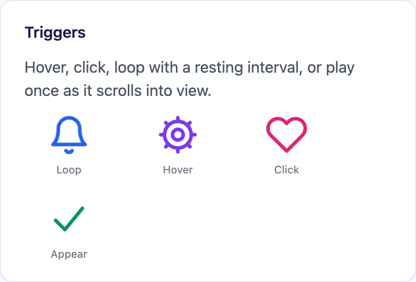
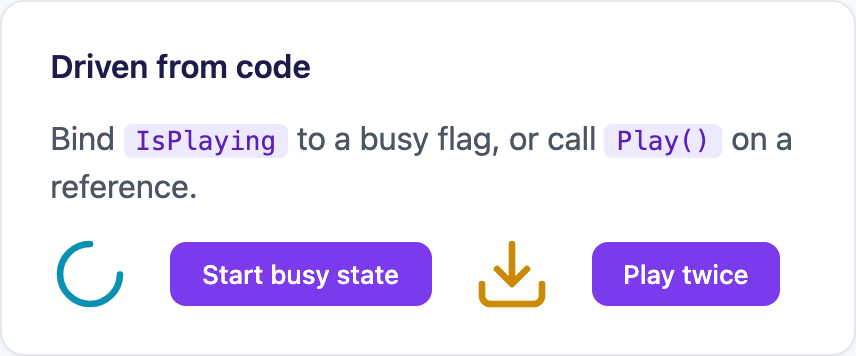
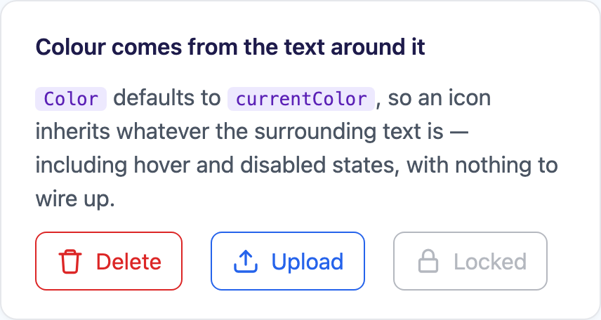
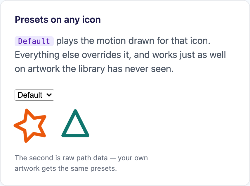
Sixty-nine new ones, each with motion authored for it rather than a preset bolted on. A folder tab that lifts off its crease. A page that turns by squashing about the spine. Three raindrops that fall, vanish and reappear above the cloud. A compass needle that settles in progressively smaller swings. A credit card that flips through a horizontal scale of zero.
They fill the gaps the original set had — a complete set of arrows and chevrons, the rest of the
transport bar, files and folders, weather, the round status glyphs — and nothing was renamed or redrawn,
so MotionIconLibrary.Names and lookup are unchanged.
The one bit I’d call out: directional icons are matched sets. Every arrow travels the way it points
and pulls its shaft in behind the head; every chevron bounces once in its own direction. Swap
arrow-right for arrow-left in an RTL layout and you get the mirrored motion for free, rather than an
icon that points left while animating right.
Stills of things that only make sense moving, MAUI first and then Blazor — the playground is the honest version:
Go get it
dotnet add package Shiny.Maui.Controls
dotnet add package Shiny.Maui.Controls.Office     # Word, Excel, PowerPoint, Notebook
dotnet add package Shiny.Maui.Controls.Camera     # CameraView + IMediaService

dotnet add package Shiny.Blazor.Controls
dotnet add package Shiny.Blazor.Controls.Office
The full 1.3 release notes have everything, including the fixes I skipped here. The playground is the fastest way to decide whether any of this is any good.
And if you do try the Office controls on something real, tell me what broke. That’s the entire feedback loop that got them this far.