Shiny Controls 1.0 — The Ultra Control Suite for .NET MAUI & Blazor
On this page
Every app I have ever shipped has had the same three weeks in it.
Not the interesting weeks. The other ones — where you rebuild a bottom sheet because the platform’s
isn’t quite right, hand-assemble a button that can show a spinner, write the fourth calendar of your
career, and glue together a chat screen out of a CollectionView, a bubble template and a bool
called IsSending. None of it is hard. All of it is slow. And you do it again on the next app,
because it was never a library, it was just code in that repo.
Shiny Controls 1.0 is the accumulation of not wanting to do that again.
One suite, two renderers — native .NET MAUI and real Blazor components, no WebViews in sight —
sharing a Material 3 style token contract. A ShinyButton on iOS and a ShinyButton in the browser
are the same control with the same API, not two lookalikes that drift apart by v1.2.
Go press things first
I would rather you clicked it than read me describing it. The whole Blazor gallery is live:
👉 shinyorg.github.io/controls
That is the actual sample project from the repo, published to WebAssembly. The theme selector in the header isn’t a mock — it swaps the real theme pack stylesheet, and every control on the page restyles itself from the tokens.
There are too many to introduce politely
I wrote three versions of this section trying to give each control a paragraph, and every one of them read like a phone book. So: here is the whole catalogue as a table, each linking to its own docs, and then I’ll spend the rest of the post on the three I actually want to talk about.
| Category | Controls |
|---|---|
| Flagship | TableView · Scheduler · ChatView · ImageEditor |
| Collections & grids | DataGrid · VirtualizedGrid · StaggeredGrid · ParallaxCollectionView · CarouselGallery · Carousel |
| Layout & overlays | Stacks & Grid · AppLayout · FloatingPanel · SheetView · Overlay · Fab & FabMenu · TreeView · FrostedGlassView · Toolbar & TabBar · StateView · Wizard · Walkthrough · Tooltip |
| Input | ShinyButton · TextEntry · AutoCompleteEntry · AddressEntry · CountryPicker · ColorPicker · FontPicker · Slider · RangeSlider · SecurityPin · SignaturePad · MediaPickerButton · DurationPicker · Speech Add-ins |
| Display & media | CameraView · MediaElement · ShinyImage · ImageViewer · Markdown · Mermaid Diagrams · Barcodes & QR · Keyframe Animation · Motion Icons |
| Status & feedback | Toast · Dialogs · ProgressBar · SkeletonView · Splash Screen · PillView · BadgeView · Feedback Service |
| Desktop | Tray Icon · Docking |
| System | Theming — the token contract, plus the Basic / Ocean / Material / Terminal / Aurora packs |
ChatView, or: stop binding a Messages collection
Chat is the control I have rebuilt the most times, and it is the one where “just bind an
ObservableCollection” quietly betrays you. Messages arrive while you are paging backwards. A send
is optimistic until it isn’t. Someone reacts to a message that is three screens up. The naive version
works for a demo and then you spend a fortnight on the rest.
So ChatView doesn’t bind a Messages collection at all. You implement an
IChatSessionProvider that hands the control a session-scoped IChatSession, and the control
subscribes to that session’s live events on attach and disposes it on detach. Paging, live inserts,
send verdicts, typing — all through one seam that the control owns.
<shiny:ChatView Provider="{Binding Provider}"
                SessionId="{Binding SessionId}"
                MyBubbleColor="#DCF8C6"
                OtherBubbleColor="White" />
public partial class ChatViewModel(IChatSessionProvider provider) : ObservableObject
{
public IChatSessionProvider Provider { get; } = provider;
public string SessionId { get; } = "demo";
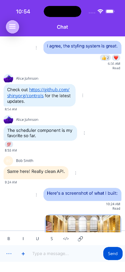
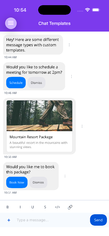
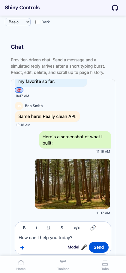
}That’s the integration. What you get for it: bubbles with grouping and per-user colours, avatars, emoji reactions, per-user read receipts, typing indicators with auto-expiry, image attachments that open in the built-in viewer, a connection banner that disables input while offline, cursor-based load-more paging that stays stable under live inserts, and optimistic send that distinguishes Failed (offer a retry) from Rejected (don’t).
My favourite detail is that permissions drive the UI rather than trailing it. PermittedEmojis
decides whether the reaction row exists; BodyPermissions gates the markdown toolbar. The control
never shows an affordance your backend is going to refuse.
Walkthrough, and the argument I had with myself
Dim the page, cut a spotlight around one control, say what it does. Product onboarding, the “what’s new” tour, the workflow someone does once a quarter and forgets every time.
The first version I wrote used attached properties — Walkthrough.Step="1" on the control itself,
because that reads beautifully in a blog post. Then I put it on a real screen: nested layouts, a
templated cell, a panel that only exists for admins. Reordering the tour meant hunting through four
files. Hiding one control silently derailed everything after it, because nothing could see the
sequence as a whole.
So the steps live together on the walkthrough, in order. Reordering is moving a line.
IsVisible="False" takes a step out of the run and re-numbers the counter for you.
<shiny:Walkthrough RememberRunKey="home-v1" AutoStart="True" OverlayOpacity="0.8">

    <!-- No target: a centred welcome card, no cut-out. -->
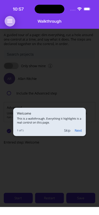
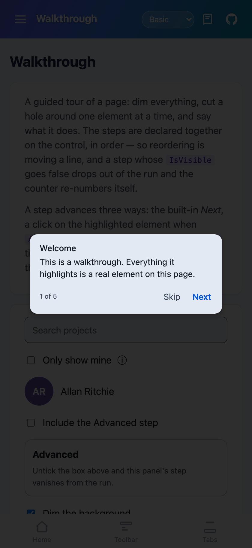
    <shiny:WalkthroughStep Title="Welcome"
                           Text="Here is what is new in this release."
                           AnimationIn="Pop" />

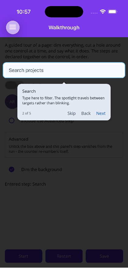
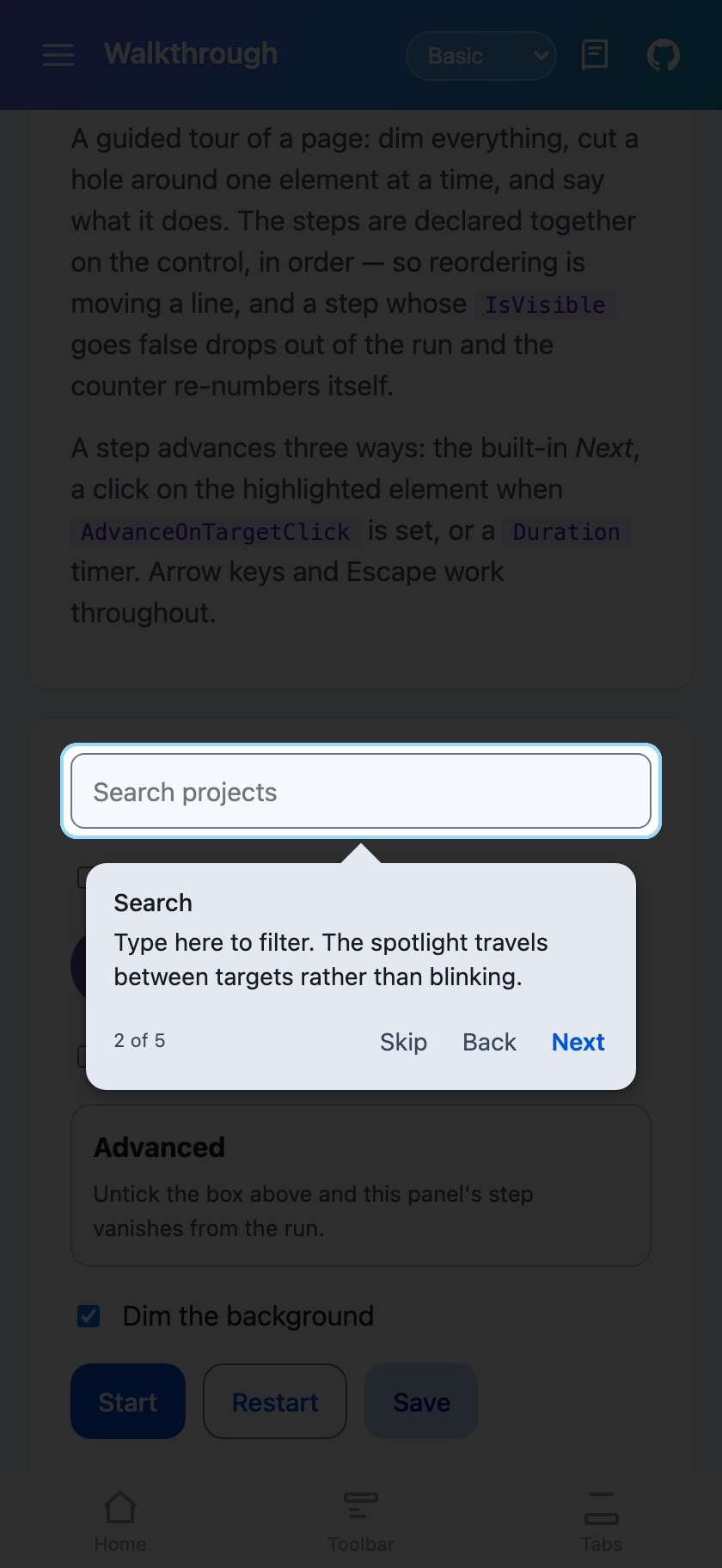
    <shiny:WalkthroughStep Target="{x:Reference SearchBox}"
                           Title="Find anything"
                           Text="Search across every project you can see."
                           Placement="Bottom" />

    <!-- No card at all; the cut-out does the pointing. -->
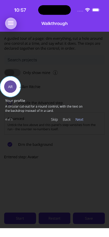
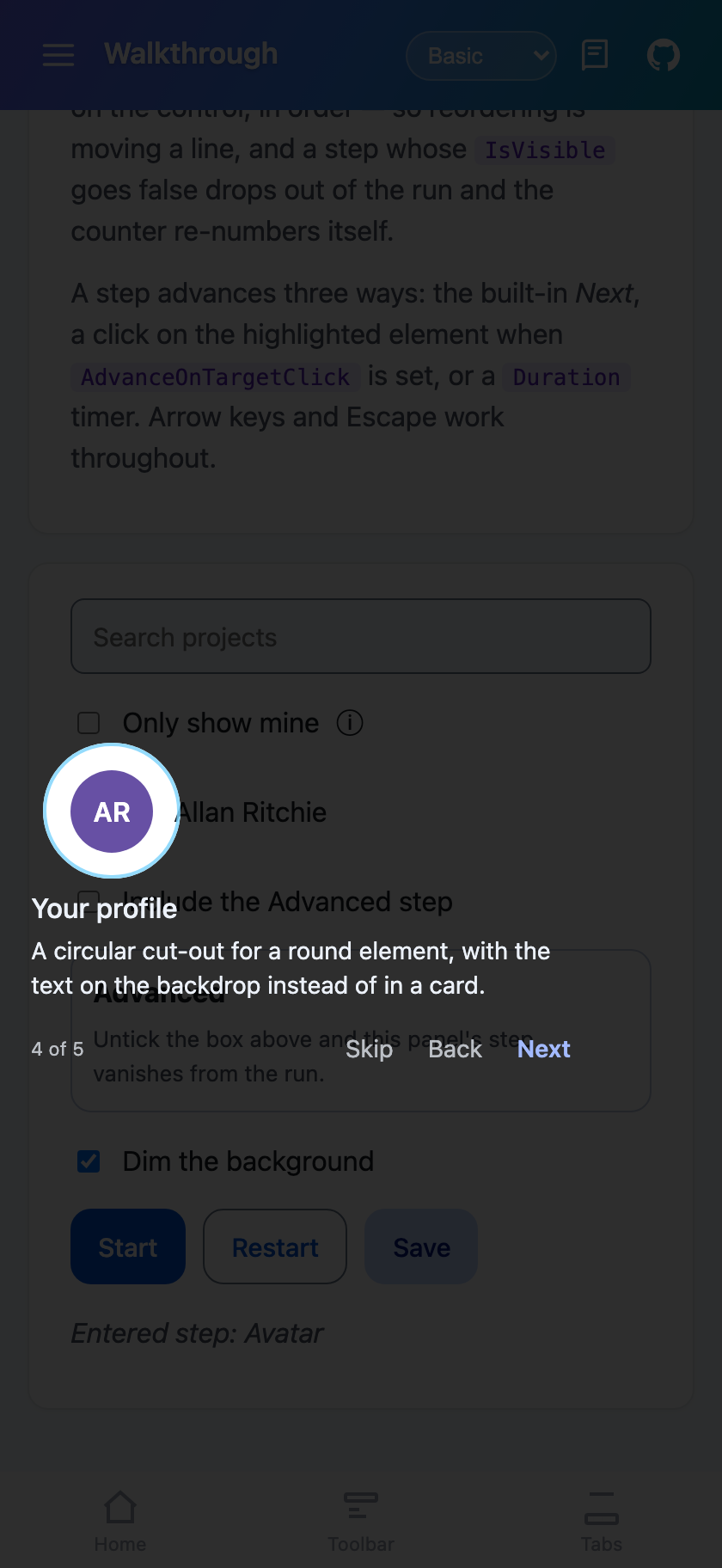
    <shiny:WalkthroughStep Target="{x:Reference Avatar}"
                           Title="Your profile"
                           Text="Settings and sign-out live here."
                           Display="Spotlight"
                           Highlight="Circle" />

    <!-- Live control: the tap reaches it through the hole, and using it advances. -->
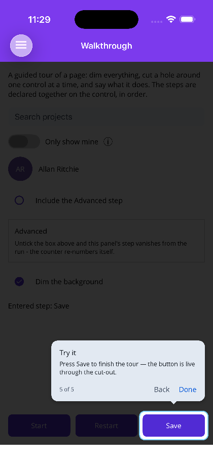
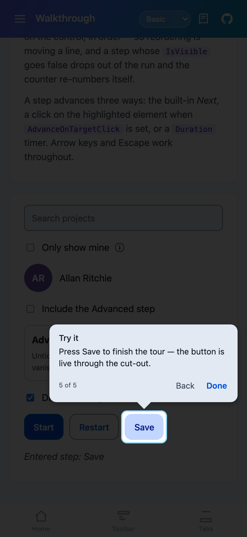
    <shiny:WalkthroughStep Target="{x:Reference SaveButton}"
                           Text="Press Save to finish."
                           AllowTargetInteraction="True"
                           AdvanceOnTargetTap="True" />
</shiny:Walkthrough>
RememberRunKey is the one that matters in production — it’s what makes onboarding run once,
backed by Preferences on MAUI and localStorage on Blazor, swappable for your own store, and
Restart() clears it. And the tour paints into a layer above the page content, so a target inside a
scroll view or a card gets highlighted where it actually is instead of clipped by its container.
Here’s the whole run on MAUI — welcome card, popover on a target, a circular cut-out for a round element, and the last step where the button underneath is still live:
And the same four steps on Blazor. This is the bit I’m actually pleased with — it isn’t a re-implementation that happens to look similar, it’s the same step list and the same spotlight geometry over a DOM instead of a visual tree:
Scheduler — write the data layer once
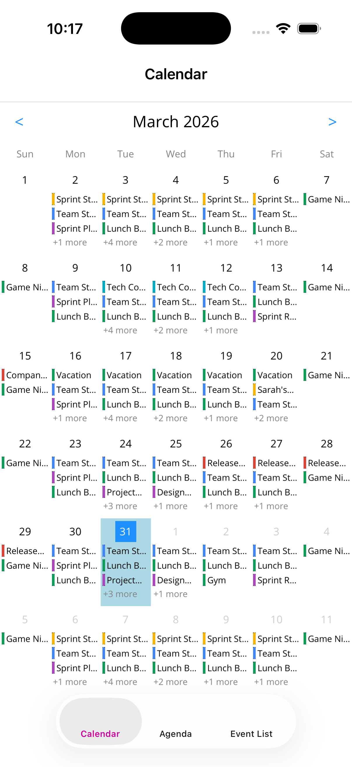
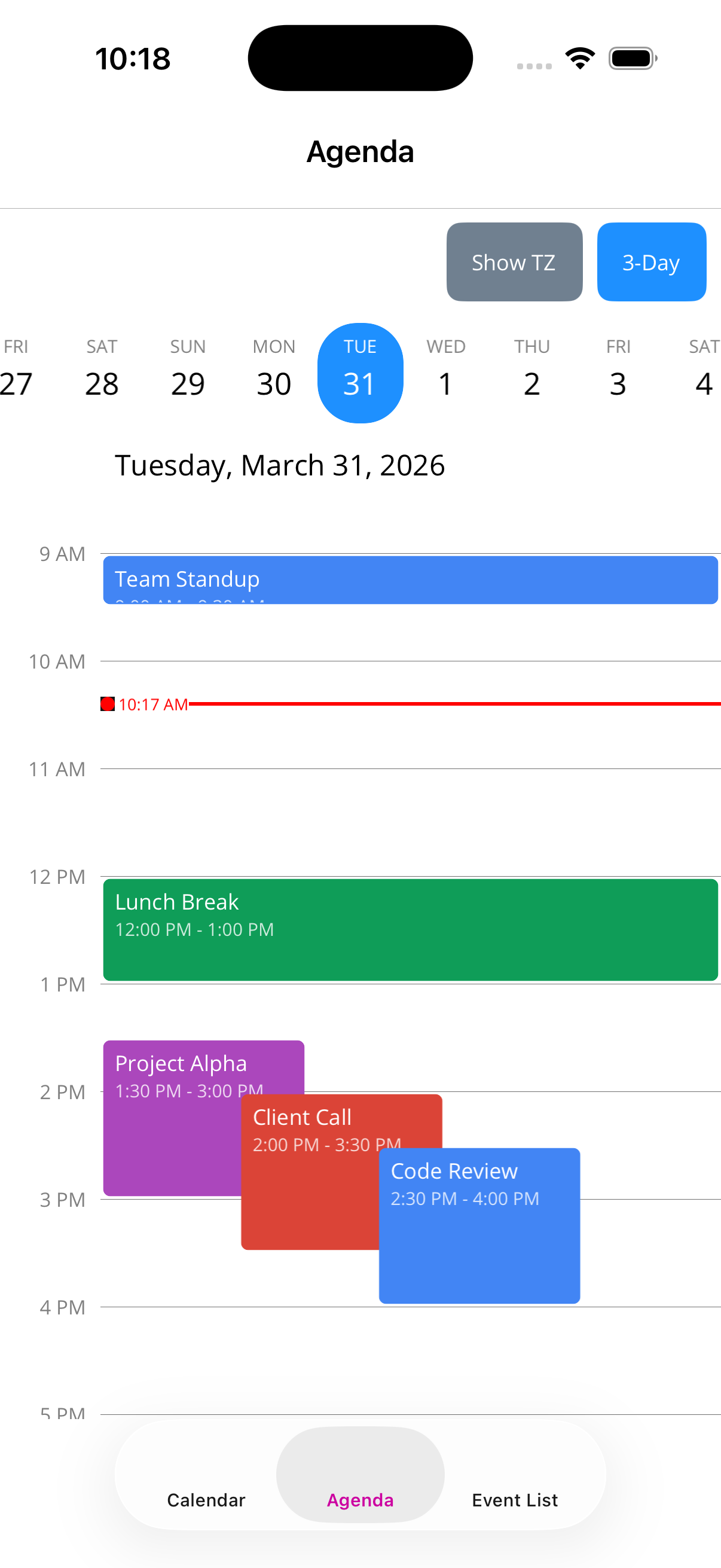
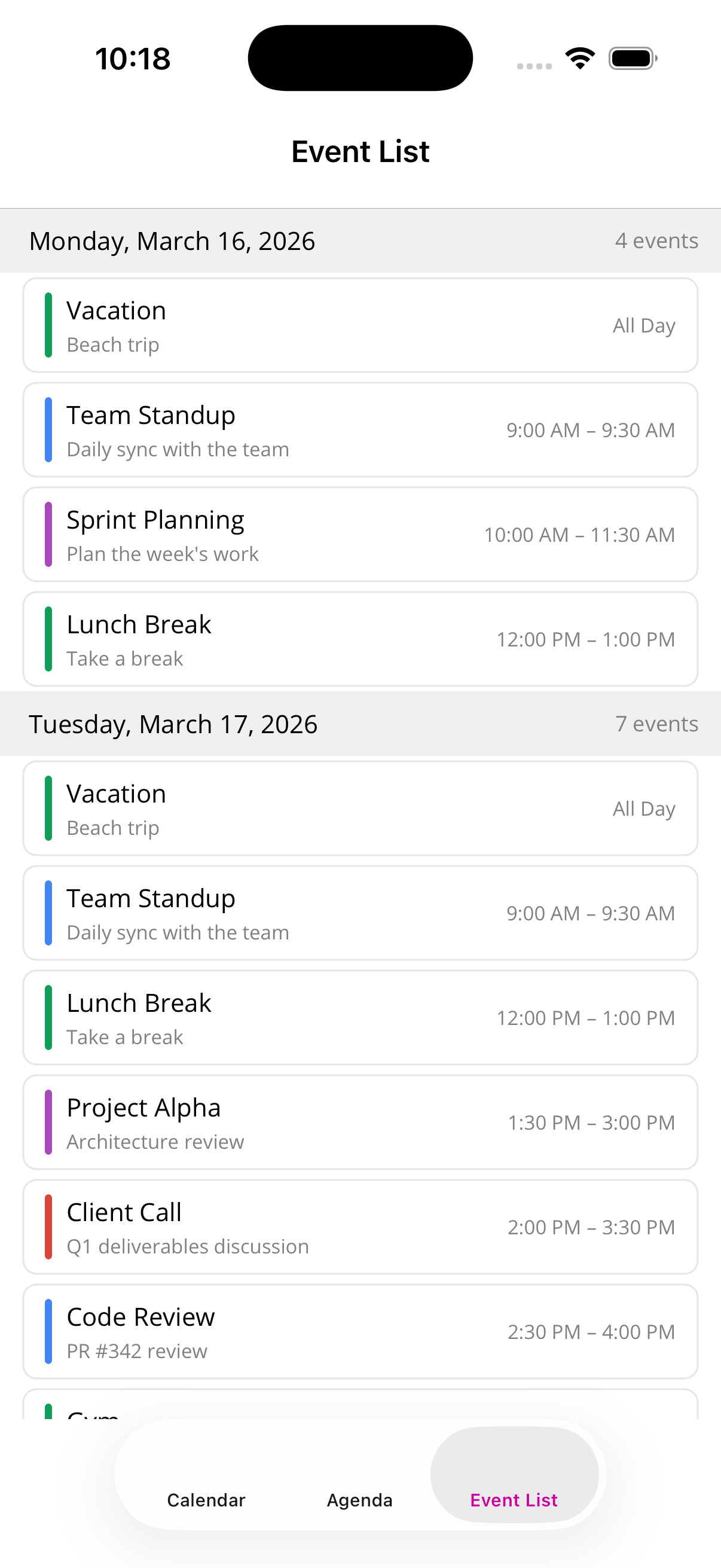
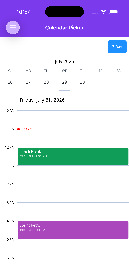
Three views: a monthly calendar grid, a day/multi-day agenda timeline, and a vertically scrolling
event list. One ISchedulerEventProvider behind all of them, so switching a screen from calendar to
agenda is changing the element name.
public class MyEventProvider : ISchedulerEventProvider
{
    public async Task<IReadOnlyList<SchedulerEvent>> GetEvents(
        DateTimeOffset start, DateTimeOffset end)
        => await myService.GetEventsAsync(start, end);

    public void OnEventSelected(SchedulerEvent selectedEvent) { /* navigate, show a sheet… */ }

    public bool CanCalendarSelect(DateOnly date) => true;
    public void OnCalendarDateSelected(DateOnly date) { }
    public void OnAgendaTimeSelected(DateTimeOffset time) { }
    public bool CanSelectAgendaTime(DateTimeOffset time) => true;
}<scheduler:SchedulerCalendarView Provider="{Binding Provider}"
SelectedDate="{Binding SelectedDate}" />Multi-day events span properly across all three views — which sounds trivial and is the single
fiddliest thing in any calendar I have written. The agenda draws a live current-time marker and can
show extra timezone columns with sticky headers. The event list scrolls infinitely both directions.
Every visual element is replaceable with a DataTemplate. Bindings use the static lambda overloads
throughout, so it’s AOT-safe with no string-based reflection.
CameraView (no screenshots, sorry)
A screenshot of a camera control is a photograph of whatever was in front of my desk. Useless. So let me just tell you what it does.
It’s a real cross-platform camera for MAUI — AVFoundation on iOS / Mac Catalyst / macOS, CameraX on
Android, Media Capture on Windows — with a matching Blazor WebAssembly control over getUserMedia.
Preview, lens and device selection, pinch-to-zoom, torch, flash, photo capture, video recording with
quality/bitrate/frame-rate control. That part is table stakes.
The part I’m actually proud of is that there are two pluggable pipelines, and they compose.
Frame analysis. Drop an IFrameAnalyzer in — declared right in XAML, since the analyzer is the
content property of CameraView — and frames stream to it off the UI thread with drop-on-busy
back-pressure. Bounding boxes draw continuously, but results are delivered on a gated scan
trigger: you call Scan(), and the next confirmed detection fires once. That distinction is the
difference between a scanner that feels deliberate and one that machine-guns events at your view
model. There’s an optional ScanWindow that restricts detection to a region and draws an aim
reticle.
Built in: barcode/QR (native Vision and MLKit, restrictable by symbology), face detection with
landmarks, motion clustered into debounced regions, OCR with scan-window crop and upscale for small
text, and structured documents — invoices with order lines, receipts with line items and per-tax
breakdowns, business cards, AAMVA driver’s licences, province-aware Canadian health cards, credit
cards, passport MRZ — each a strong record with nullable fields rather than a bag of strings. And
when the document is free-form, AiDocumentAnalyzer<T> detects that a document is present cheaply
on every frame, then sends exactly one frame to a Microsoft.Extensions.AI IChatClient for
structured extraction. One model call per document, not per frame, which is the difference between a
feature and a bill.
Effects. Effects is an ordered, live collection applied to the preview, captured stills and (on
Apple) recorded video. Mutate it while the camera is running and the change lands on the next frame.
Eleven colour grades, five spatial GPU looks (comic, sketch, posterize, pixelate, blur), compositing
draw effects for watermarks and face masks anchored to tracked facial landmarks, and slow
post-capture transforms like AI photo stylization through an MEAI IImageGenerator.
Per-platform coverage here is genuinely uneven and I refuse to pretend otherwise, so
GetEffectSupport(effect) returns Full / ColorOnly / StillOnly / Unsupported and your UI can
grey out what would silently do nothing.
Two more worth knowing: you can record and analyse simultaneously on every platform — a dash-cam
reading signs off its own live feed while recording — and VideoRecordingOptions.Overlay burns a
watermark, timestamp or telemetry into every encoded frame, drawn with Microsoft.Maui.Graphics so
one implementation covers every platform.
None of it is styled by hand
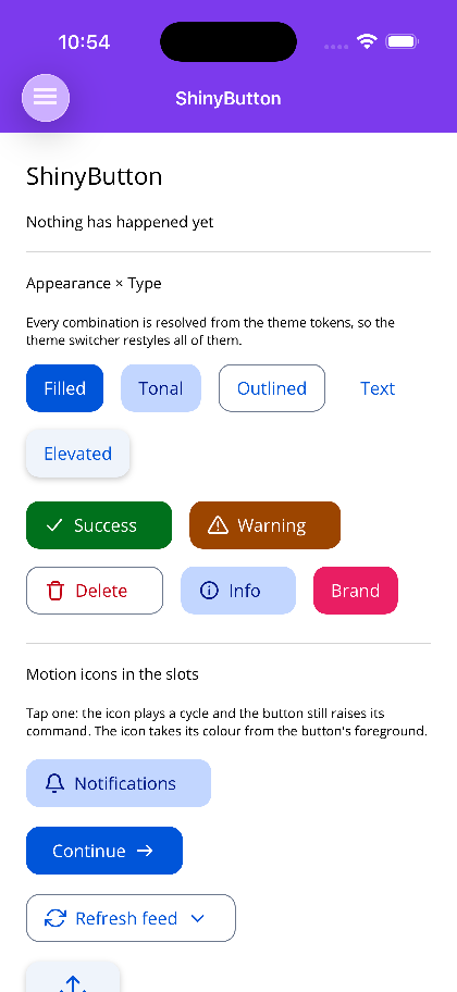
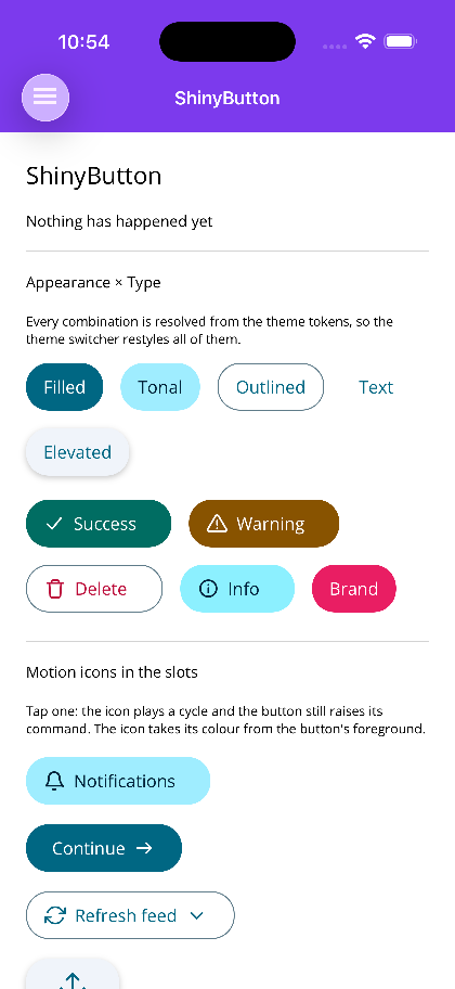
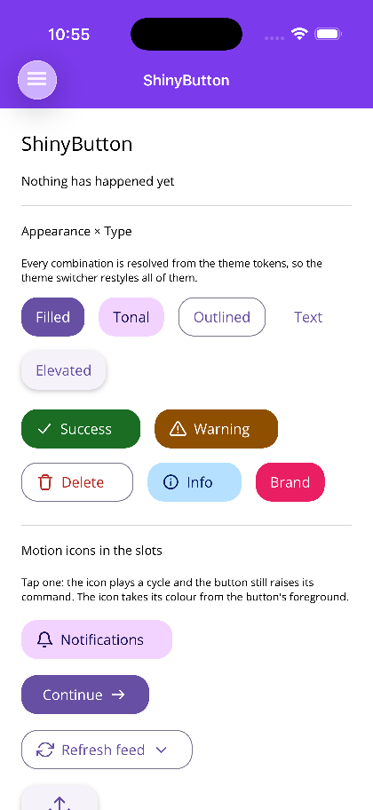
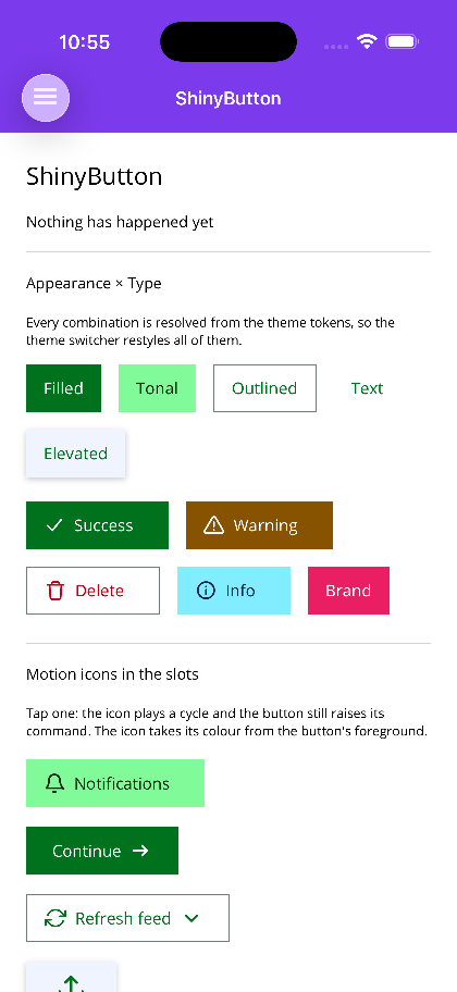
Colour roles, surfaces, shape, elevation, typography, density, borders, state, spacing — it’s a
token contract the controls read. SetDynamicResource on MAUI, var(--shiny-*) on Blazor. The
core packages ship the contract and a Basic theme; Ocean, Material, Terminal and
Aurora are separate NuGet packs that change the whole app without touching a page.
Here’s the identical button gallery under all five:
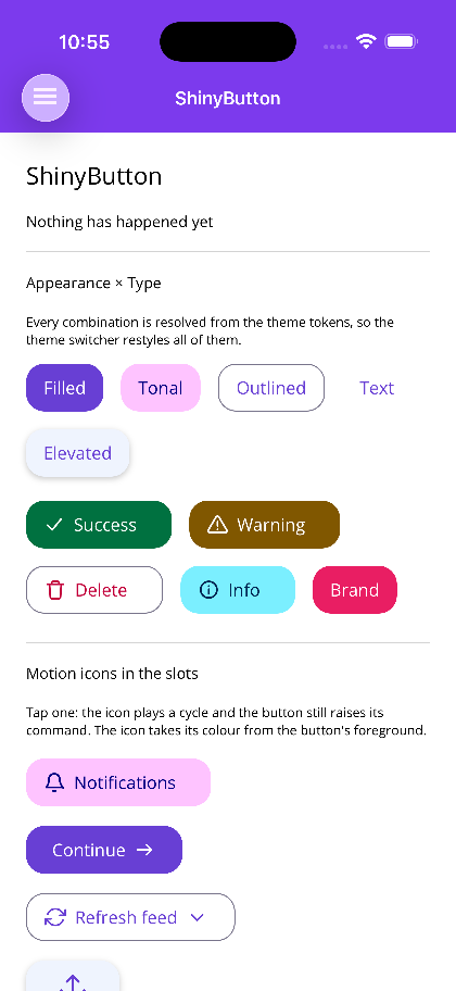
Want your own? The Theme Creator takes a few seed colours and exports the theme JSON, the Blazor CSS, or the MAUI C#.
Go get it
dotnet add package Shiny.Maui.Controls     # .NET MAUI
dotnet add package Shiny.Blazor.Controls   # Blazor
Then go break things in the playground, and the docs have the rest.
That’s 1.0. Three weeks of every future app, already written.