Level Up Animation with Keyframes for MAUI & Blazor
On this page
Here’s something that shouldn’t be hard but is: animate a card, then let the user drag it backwards.
In MAUI you reach for FadeTo / ScaleTo / TranslateTo, you get a Task, and everything is fine until the
requirements grow up. Scrub it from a slider. Reverse it halfway through. Hold the final pose instead of snapping
back. Export the same animation as a GIF for the marketing page so it matches the app exactly. Every one of those
is a rewrite, because the animator you’re using accumulates — each frame is computed from the last one, so there
is no such thing as “the state at 0.62”.
So I went and built the thing I actually wanted, and then kept pulling the thread. It turned into three pieces that stack:
- Keyframe — the CSS
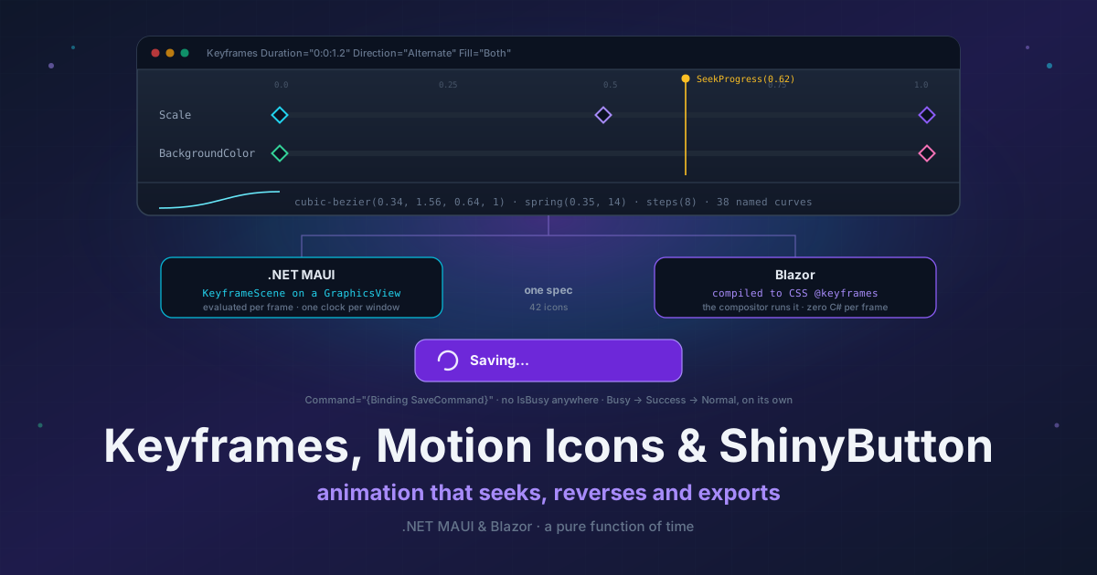
@keyframesmodel in XAML, plus a fluent C# timeline API, where evaluating an animation is a pure function of time. - Motion Icons — 42 animated icons authored once and compiled into a drawn scene on MAUI and real CSS
@keyframeson Blazor. - ShinyButton — where the first two land in a real app: press a button, wait for the network, see whether it worked.
You can poke at the last two right now in the Blazor playground — no clone, no install. Hover the icons, mash the buttons, watch the busy states run.
The constraint I refused to give up
Evaluate(t) computes the state at t from the keyframes alone. It never reads the previous frame and it never
accumulates. That is the whole design, and everything I actually wanted falls straight out of it:
| I want to… | I do this | Instead of |
|---|---|---|
| Scrub from a slider or a gesture | player.SeekProgress(x) |
Rebuilding a timeline at the new position |
| Reverse mid-flight | player.Rate = -1 |
Building a second, reversed timeline |
| Export frames | Sampling at exact frame times — identical bytes every run | Rendering off a real-time clock and hoping |
| Test the timing | Stepping a ManualClock |
Task.Delay and a tolerance |
That last row is the one I underestimated. Timing tests that step a manual clock don’t flake, ever, and they run
in microseconds. I have deleted a lot of await Task.Delay(500) since.
And reversing is genuinely reversing. Rate scales the per-frame delta rather than the position, so flipping it
mid-flight carries on from wherever the animation actually is instead of jumping to a rescaled position. “Reverse”
and “restart backwards” look identical in a demo and nothing alike under a finger.
It’s just @keyframes
I didn’t invent a model. The web solved this in 2009 and everybody already knows the vocabulary, so
Animate.Keyframes is an attached property that behaves exactly like a CSS @keyframes rule and its
animation-* properties — Duration, Delay, Iterations, Direction, Fill, per-key easing, all of it:
xmlns:kf="http://shiny.net/maui/keyframe"

<Border>
    <kf:Animate.Keyframes>
        <kf:Keyframes Duration="0:0:1.2" Iterations="Infinite" Direction="Alternate" Fill="Both">

            <kf:Track Property="Scale">
                <kf:Key Offset="0"   Value="1" />
                <kf:Key Offset="0.5" Value="1.15" Easing="CubicOut" />
                <kf:Key Offset="1"   Value="1" />
            </kf:Track>

            <kf:Track Property="BackgroundColor">
                <kf:Key Offset="0" Value="#2563EB" />
                <kf:Key Offset="1" Value="#EC4899" />
            </kf:Track>

        </kf:Keyframes>
    </kf:Animate.Keyframes>
</Border>
No builder.Use…(). That XAML namespace is the installation.
The same animation in C#, because a designer-authored one and a data-driven one shouldn’t be two different engines:
var timeline = TimelineBuilder
    .Create(TimeSpan.FromSeconds(1.2))
    .PingPong()
    .RepeatForever()
    .Fill(FillMode.Both)
    .Animate(box, (v, x) => v.Scale = x, k => k
        .From(1)
        .Key(0.5, 1.15, Easings.CubicOut)
        .To(1))
    .Build();

var player = box.Play(timeline);
Sticking to the CSS model paid off in a place I didn’t plan for: easing curves paste in. Somebody hands you a curve out of Figma or the browser devtools panel, and it just works:
<kf:Key Offset="0" Value="-200" Easing="cubic-bezier(0.34, 1.56, 0.64, 1)" />
<kf:Keyframes Easing="spring(0.35, 14)" ... />
<kf:Keyframes Easing="steps(8)" ... />
The spring is a closed-form solution of the ODE rather than a numeric integration, which I did for one reason: an
integrated spring can’t be seeked. Solve it and it stays a pure function of t, so it scrubs and reverses like
every other curve. There are 38 named curves too, and an unrecognised easing string throws at parse time with a
list of what is registered — rather than quietly running linear on someone’s device six months later.
A few other things I’d want to know before adopting this:
- Colours blend in Oklab by default. sRGB dips through grey at the midpoint and always has. It looks cheap and nobody can ever explain why.
Rotationtakes the shortest arc. 350° to 10° turns forward 20°, not back 340°.Spinis there for when multiple turns are actually the point.- Omit
Valueon a key and it resolves to the target’s live value when playback starts, so a re-triggered animation continues from where it is instead of snapping back. - It’s AOT and trim safe. The property registry is hand-registered delegates — not reflection, not compiled
Expressiontrees. Both of those work beautifully in the emulator and vanish on device under Native AOT, which is a debugging afternoon I would like to save you. - Targets are held weakly. An infinite animation on a popped page goes inert and gets collected instead of
pinning the visual tree, so you can use
Iterations="Infinite"without thinking about it.
Then it grows: Storyboard sequences, overlaps and staggers whole timelines on a shared clock and nests inside
itself. KeyframeScene runs the same timing model against a layer tree drawn on a canvas — the Lottie-shaped
lane, for loaders and illustrated micro-animations — and because both are nodes on one clock, a single storyboard
can sequence real views and drawn layers together.
And since sampling is exact, you can render a scene offscreen with no UI thread anywhere in sight:
var exporter = new FrameExporter(scene);
var options = new ExportOptions { Fps = 25, Scale = 2.0 };

GifEncoder.EncodeToFile("out.gif", exporter.Frames(options), options.Fps);
Frames stream lazily, frame times are computed as index / fps in ticks so a long export can’t drift, and the
GIF encoder is pure managed code. It targets plain .NET rather than the platform TFMs, so it runs from a console
app or CI — I generate the docs GIFs from the same scene the app ships. (Use 25 or 50fps. GIF stores delays in
hundredths of a second, so 30fps actually plays at 33.3. That one cost me an afternoon.)
Blazor doesn’t get this, deliberately. The web already has @keyframes, natively, composited off the main
thread. Shipping a C# render loop to compete with the browser’s compositor would be worse in every measurable
way. Which brings me to the part I’m most pleased with.
42 icons, one spec, two completely different engines
I wanted animated icons on both hosts that actually match — not “similar, roughly, if you don’t look at the bounce”. A bell that swings from its crown with the clapper catching up late. A hamburger that morphs into a cross. A tick that draws itself on. A spinner whose arc chases its own tail.
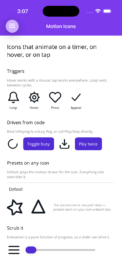
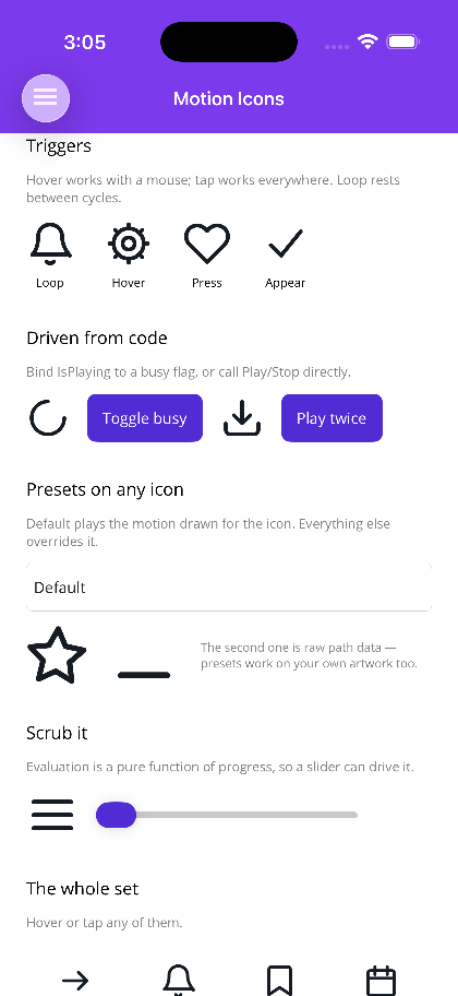
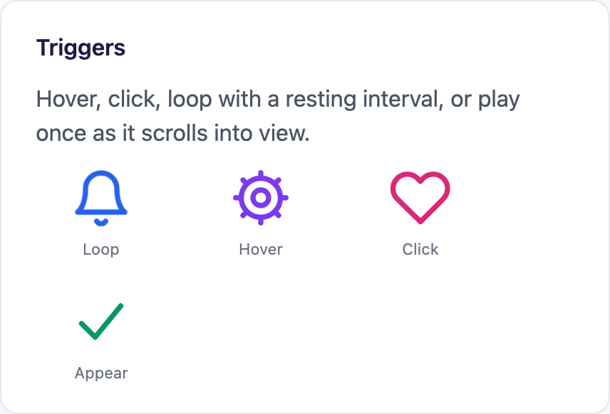
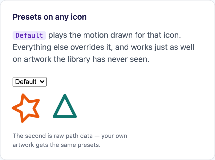
Those are stills of moving things, which is a bit like reviewing a song from the sheet music — the playground is the honest version.
They live in the core packages, so there’s nothing extra to install and nothing to register:
<!-- MAUI -->
<shiny:MotionIconView Icon="bell" Trigger="Loop" Interval="0:0:1.5" WidthRequest="32" HeightRequest="32" />
@* Blazor *@
<MotionIcon Icon="bell" Trigger="MotionTrigger.Loop" Interval="TimeSpan.FromSeconds(1.5)" Size="32" />The artwork and its motion live in one dependency-free package both hosts reference. What each host does with that definition is where it gets interesting:
| .NET MAUI | Blazor | |
|---|---|---|
| Rendering | a KeyframeScene on a GraphicsView |
inline SVG |
| Animation | a keyframe Timeline, evaluated per frame |
compiled once to CSS @keyframes |
| Driven by | the Keyframe engine’s Player, one shared timer per window |
the browser’s compositor |
| C# per frame | evaluate + redraw | none |
Zero C# per frame on the web. The icons keep animating at the display’s refresh rate while WebAssembly is off doing something expensive, because the browser is running them and the browser doesn’t care what your app is busy with. I’m not going to beat that with a ticker, so I didn’t try.
On MAUI there’s no compositor to hand it to, so an icon is drawn — but by the Keyframe engine rather than by machinery of its own. Motion icons and hand-written timelines share one clock, one set of easing curves and one implementation of rate and baselines. Same spec, same curves, both sides: an icon moves the same on a phone and in a browser.
Getting the curves to agree was the fiddly bit. Where CSS has a keyword meaning exactly what a MotionEase
member means, the generated stylesheet uses it. Everything else — the overshoot and bounce curves CSS has no
name for — gets sampled into a linear() curve rather than approximated with a “close enough” cubic-bezier,
because a bounce that bounces differently in the browser than on the phone is exactly the kind of thing that
makes people stop trusting a cross-platform library.
Two more decisions I’ll defend:
There is no path-morph channel. Every channel — opacity, translate, rotate, scale, stroke width, trim,
colour — has a native, identically-behaving implementation on both hosts. Animating SVG’s d isn’t supported
everywhere, so a morph channel would have meant hand-written fallbacks the moment somebody opened Firefox.
Hinged and “morphing” icons are built from separate parts moved by transforms instead, exactly as you’d do it in
a design tool — and exactly how the hamburger becomes a cross.
The Interval gap between loops is folded into the animation itself, not scheduled by a timer. A CSS
animation can’t pause between iterations, so expressing the gap externally would have needed a JS timer on the
web and a dispatcher timer on MAUI, and the two would drift apart within a minute. Squeeze the keys into the
front of a longer cycle, hold the resting pose through the remainder, and animation-iteration-count: infinite
does the whole job.
Triggers are a [Flags] enum defaulting to Hover | Press — hover for desktop, press for touch, sensible
everywhere without being told. Add Loop, Appear (an IntersectionObserver on the web), or Manual bound to
a busy flag. And on MAUI Progress is two-way, which means you can drag a slider and morph the hamburger into a
cross by hand — the pure-function-of-time thing paying rent again.
Bring your own artwork with raw PathData, or a multi-part definition where each part is a thing a track can
target. One warning that cost me real time, now written down so it doesn’t cost you any:
Microsoft.Maui.Graphicsdoesn’t implement SVG’s implicit-lineto rule."M6 6 18 18"is a diagonal line in a browser and nothing at all on MAUI — the parser reads the second pair as another moveto. It also can’t read run-together decimals:l.06.06stops it dead and the rest of the path is silently dropped. Both forms are everywhere in exported artwork, and both render perfectly on Blazor and as a bare dot on MAUI. Write"M6 6L18 18"andl.06 .06.
And then the button, which is the whole point
Here’s the thing that made me build the other two. Microsoft.Maui.Controls.Button renders text and one image.
There is no way to put a spinner in it. So the single most common interaction in any app — press, wait for the
network, see whether it worked — gets hand-assembled on every page out of a Grid, an ActivityIndicator, a
swapped label, and an IsBusy property on the view model that exists purely so the UI has something to bind to.
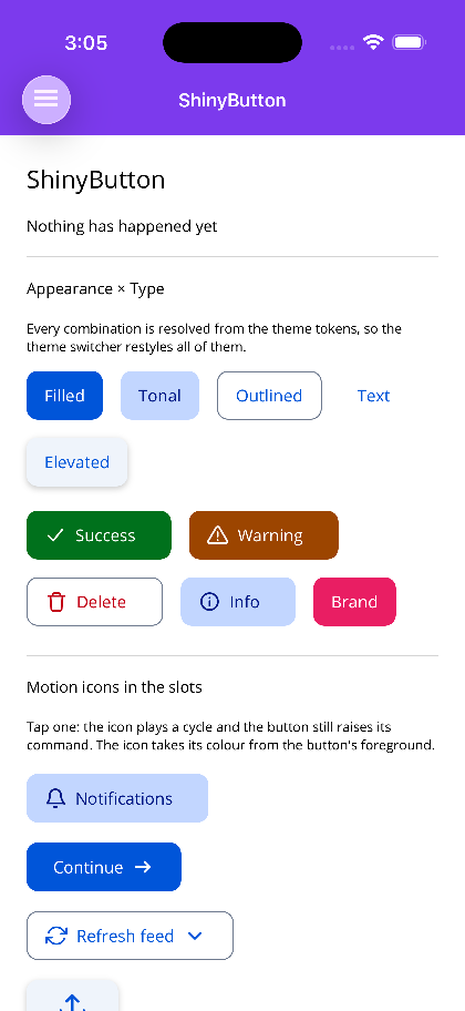
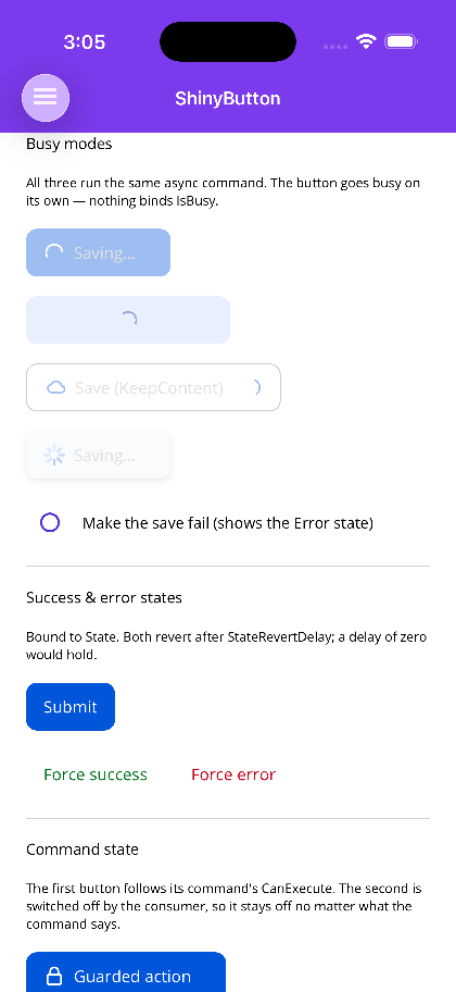
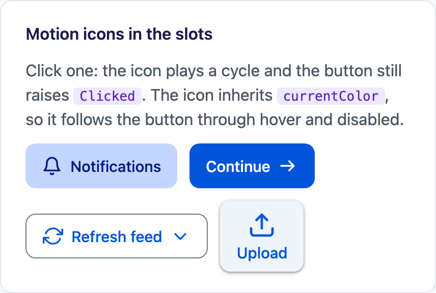
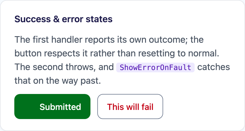
ShinyButton is that assembly, done once, on both hosts:
<!-- SaveCommand is an AsyncRelayCommand. This is the entire wiring. -->
<shiny:ShinyButton Text="Save"
                   BusyText="Saving..."
                   LeftMotionIcon="download"
                   Command="{Binding SaveCommand}" />
Nothing there binds IsBusy, because there is no IsBusy. The button subscribes to the command, works out that
it’s async, and runs Normal → Busy → Normal itself. If the task faults it lands on Error instead. Each state
can stand in its own text and its own icon, and Success/Error revert on their own after StateRevertDelay.
On Blazor there’s no ICommand, so the equivalent is that Clicked is awaited — an async handler holds the
button busy for exactly as long as it runs:
<ShinyButton Text="Save" BusyText="Saving..." LeftMotionIcon="download" Clicked="SaveAsync" />

@code {
    async Task SaveAsync() => await http.PostAsJsonAsync("/api/save", model);
}
A synchronous handler never flickers, incidentally — the task is checked for completion before any state change, so a handler that finished inline doesn’t produce a one-frame spinner. That’s the kind of detail you only find by using the thing.
Two more of those, because they’re the reason I think this is worth writing about:
Setting IsBusy false will not cut a Success short. A view model clearing its busy flag in a finally
block is precisely the moment the tick is on screen, and the naive projection wipes it before anyone sees it. So
IsBusy = false only unwinds Busy, never Success or Error.
ReplaceContent fades the content to opacity zero rather than hiding it. Hiding collapses the button to the
width of the spinner and shoves the rest of the row sideways mid-operation. Keeping it laid out but invisible
pins the width, with no measuring on your part. The default mode goes further and swaps the spinner into the
left icon’s slot — both are IconSize square, so the button physically cannot change width.
And the disabled state goes through MAUI’s own IsEnabledCore — the same mechanism the built-in Button uses —
rather than writing IsEnabled. Writing IsEnabled would clobber your binding, and a command becoming
executable again would silently re-enable a button you’d deliberately switched off. That one is a real bug I’ve
shipped before, in code I wrote by hand, on a deadline.
The icon slots take an image, any View, or a motion icon name — and the motion icon is the path worth taking.
The button colours it from its own resolved foreground and plays it from its own tap, so tapping anywhere on the
button animates the glyph rather than only a tap that lands on it. That’s the three pieces closing the loop: a
keyframe engine, an icon spec compiled two ways, and a button that uses both so you don’t have to think about
either.
Go press something
- Blazor playground — motion icons and
ShinyButton, live. - Keyframe docs — XAML, easing, timelines, drawn scenes, offscreen export.
- Motion Icons docs — the icon set, triggers, presets, custom artwork.
- ShinyButton docs — states, commands, Blazor usage.
dotnet add package Shiny.Maui.Controls.Keyframe   # MAUI keyframe engine
dotnet add package Shiny.Maui.Controls            # motion icons + ShinyButton
dotnet add package Shiny.Blazor.Controls          # same, on the web